Beauty in web design, part 2
The second part of a 3-part essay, based on my presentation at SXSW Interactive.
Three types of beauty
In Part 1 we saw that the web presents an ideal vehicle for beauty. But how will we know it when we see it? What is beauty anyway? I consider beauty to be presented in three main modes: universal, sociocultural and subjective.
Universal beauty
Universal beauty is based on timeless, globally accepted principles. It seems to hit at some innate response within us all, as demonstrated by the concept of human ‘averageness’. Here, we see a composite image of dozens of female faces created by Face Research. We might expect to see average attractiveness as a result, but this prototype is certainly more attractive than average. One theory is that prototypicality shows the mate has no defects and thus is likely to produce healthy offspring. Another theory claims that average faces are pleasing because the brain finds them easier to process. (Perhaps the average face is Plato’s ideal Form in the flesh).
Designing for universal beauty involves careful consideration of the fundamental aesthetic principles of design, such as symmetry, harmony, the rule of thirds and the golden ratio.
Sociocultural beauty
Sociocultural beauty is governed by the preferences of a particular time or place. This is most clearly seen in sexual attitudes.
Here we see Rubens’ Venus and a modern runway model: a clear depiction of changing sociocultural attitudes to beauty. (Please forgive these rather sexist examples. Since throughout history nothing has been studied for its beauty as much as the female form, it makes for clear illustration.)
However, there are more subtle examples: fashion, music trends and even philosophical interpretations of the world all go in and out of style, regardless of their inherent universal beauty.
Subjective beauty
Subjective beauty is the wholly personal encapsulation of one’s likes and dislikes. If you like big butts and cannot lie, you’re merely exercising your right to a subjective opinion on beauty. While Rubens’ work is reflective of the Baroque era, it also reveals his subjective preference for larger models.
These three types of beauty are hierarchical. Subjective beauty can overrule sociocultural beauty: we can individually find beauty in things that society considers out of fashion. Sociocultural beauty can in turn overrule universal beauty: universally beautiful things may simply not be en vogue in a particular time or place.
Three modes of design
So how can we design for these types of beauty? Don Norman’s book Emotional Design gives a deep exploration of the role of emotion & beauty in design. Adapting an established model of cognitive processing, Norman claims design typically falls into one of three dominant modes.
Visceral design is aimed at our gut. We experience a visceral reaction when we bite into a sweet apple, see a stunning sunset or hear a harmonious chord – it’s entirely sensory, before the brain has a chance to shape the feeling. A positive visceral response is often called attraction – it’s what draws bees to flowers, or babies to a beautiful face.
To design for visceral response, we should concentrate on immediate properties of a system: shape, colour and form. These can make the instant impact required for a visceral reaction – we know, for instance, that visceral response to a website can occur in fractions of a second.
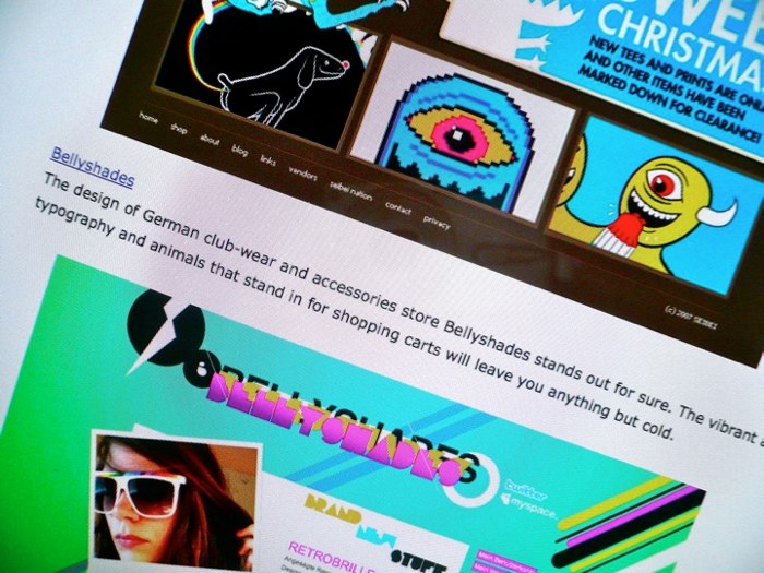
Visceral design was an early frontier of exploration for the web, once the technology was sufficiently mature. This early landrush of artistic, highly visual sites was helped by the advent of visually-oriented authoring tools such as Dreamweaver, which helped graphic specialists make the leap into the web arena with familiar UIs.
It is easy to belittle visceral design as ‘eye candy’, but without this immediate attraction, sites struggle to succeed in other modes of design. That said, visceral design’s clear failing is that it rewards attraction over usability and real beauty. Command-Shift-3, which describes itself as the HotOrNot of web design, has all the depth of a wet T-shirt contest. Since we can’t use the sites it features, we must judge solely on aesthetics. Visceral sites often win awards (since awards are rarely concerned with use) and appear in those ‘Top 20’ lists we all know and dread.
Behavioural design
Behavioural design is concerned with use. Does the system work? Is it easy to perform my tasks? Does it sustain flow, or make us suffer constant interruptions by not doing what we expect? To achieve successful behavioural design, we can call on our nearest ergonomist or usability specialist. She will ensure our design has appropriate dimensions, is well mapped to user mental models, is forgiving of improper use, sends clear messages about function, and so on.
No one can deny that the web usability movement has been successful. However, understanding the user’s tasks and crafting a site around them isn’t sufficient to bring us genuine beauty. The reason is that behavioural design doesn’t always trump visceral design. Social psychologists have found, for instance, that women prefer prototypically attractive men (square jaws, broad shoulders etc) for one-night stands and flings, but they choose more feminine, ‘nicer’ men for commitment: the so-called “cads and dads” theory. This pattern is particularly pronounced at certain points of the female ovulation cycle. In short, we don’t always plump for reliability; sometimes we need something more exciting.
Perhaps the usability movement has created too many dads, and too few cads. Critics often claim it has ‘made the web boring’ – and it’s true that, when misapplied, usability approaches can create very mediocre products. For a slightly daft example, look at the work of artists Vitaly Komar & Alexander Melamid, who surveyed the musical preferences of the general public. They asked opinions on instrumentation, tempo, pitch, duration and lyrical subject and assembled these into two musical extremes: the Most Wanted Song and the Most Unwanted Song.
The Most Wanted Song features a soft rock / R&B sound, using well established instruments. To quote the artists, it creates “a musical work that will be unavoidably and uncontrollably liked by 72% of listeners”. Unsurprisingly, this crowdsourced composition, designed for maximum ‘ease of listening’, is anything but beautiful.
The Most Unwanted Song is 25 minutes long, veering wildly between extremes of loud & quiet, fast & slow, low & high pitch. It also features the world’s most hated instruments: the accordion, bagpipe, banjo & tuba, a rapping operatic soprano and a children’s choir. “Assuming no covariance, fewer than 200 individuals of the world’s total population would enjoy this piece.”
Listening to The Most Wanted Song, we can almost understand why some people equate usability with tedium. While it can help our sites to become useful and profitable, it can’t make them beautiful. For that, we should aim at the third, most complex mode of design.
Reflective design
Reflective design reaches beyond visceral and behavioural design to look at message and meaning. It asks difficult questions. What does this system say about who I am? Does it improve my life? Am I glad I did it? These questions are subjective and complex, and our responses will vary with experience, personality, culture and even mood. But there are strong benefits to asking them. Successful reflective design makes us feel good: we show it off, tell others and repeat the experience. It can even change the way we think about things. In short, I believe that successful reflective design and beautiful design are one and the same.

Consider the Nextime Word Clock. It’s made from two cylinders that rotate so that the time can be read from the face: “Five minutes to ten” or “It’s about four”. It’s less accurate than a cheap digital watch and hence less usable – and, while it looks good, it’s not as elegant as an analogue clock. But, to me, this clock is an excellent example of reflective design. Its accuracy is appropriate for the living room (do you really need to know the difference between 2:57 and 2:58?) and its unconventional design is a conversation starter. I see beauty in the concept, and the product says something about me. It’s for these reasons, rather than usability or attraction, that I count this clock as one of my favourite possessions.
Where usability focuses on behavioural design, reflective design is more the domain of user experience. It involves truly understanding what makes people tick and what makes them excited. It involves creating something meaningful that changes perceptions. Reflective design is a relatively recent focus on the web, which is perhaps why we’ve not yet created beautiful websites. But with sufficient focus on experience, I believe we will.
Rates of change
These three modes of design – visceral, behavioural and reflective – move at different speeds, creating shearing layers (familiar from Stewart Brand’s How Buildings Learn).
Visceral trends come and go in a matter of months. Top 20 trends are quickly dated, be they illustration, fat footers or any other pattern du jour. Behavioural innovation is slower. Interaction design patterns and de facto standards (search box in the top right, logo and link to homepage in top left) emerge over the course of years and require more traction and mass support to become established. Reflective design moves the slowest of all. This is best demonstrated by ‘movements’ that define how we interact with the web – social media, the realtime web and so on – which take many years to emerge and stabilise.
Concluded in Beauty in web design, part 3