Designing with context
Once, the internet was a parallel universe, quite separate to our own. Those who wished to cross the dimensional gap needed a wormhole. We called that wormhole a PC. The (double) click of a button sent you into the virtual world, and when you were done you returned, stood up, and carried on with your day. As with most sci-fi, this precious technology was first the plaything of the rich: techies, scientists, white collar Westerners.
Today, pervasive connectivity and cheap components have turned technology inside out. The internet is now part of our world. Millions of devices – PCs to smartphones, consoles to wristwatches – act as a canvas, bringing it into the lives of a truly diverse audience across the globe. The divide between the physical and digital worlds has broken down, meaning new contexts of use have come to the fore.
Context is a slippery topic that evades attempts to define it too tightly. Some definitions cover just the immediate surroundings of an interaction. But in the interwoven space-time of the web, context is no longer just about the here and now. Instead, context refers to the physical, digital, and social structures that surround the point of use.
This definition is expansive, but we need only look at daily life to see that context has profound effects. Mechnically, a football match is the same wherever it’s played; yet context skews the odds: a team playing at home receives a proven advantage from their favourable environment, fan support, and potentially even elevated hormonal response.
The digital community has yet to fully understand the facets of the multicontext era. As a result, two stereotypes pervade: the desktop context and the mobile context.
Context stereotypes
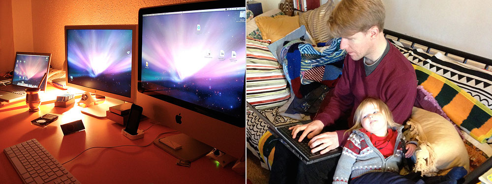
The desktop context stereotype is familiar to any web designer, where it’s been the contextual default for years. In this stereotype, the user sits comfortably in front of a ‘proper computer’. The room is well lit, the pencils sharp. Although ringing phones or screaming kids will intrude at times, we think of this context as ideal for tasks that demand deep or prolonged concentration: filling in forms, say, or detailed research.
In the mobile context stereotype, the user is in an unfamiliar setting. Public transport invariably features: “man running after a bus”, and so on. Easily distracted by his environment, our user pulls out his smartphone in sporadic bursts, in search of local information or succinct answers to specific questions. We believe therefore that the mobile context is perfect for location services, wayfinding, or any product that helps users get near-instant value.
Both stereotypes contain morsels of truth. Certainly it’s easier to concentrate while comfortable and static, and smartphone users do play with their handsets during downtime. But the stereotypes are fundamentally lacking.
First, the desktop context is hardly a uniform concept. Not only do desktop computers offer a huge variety of screen sizes, operating systems, and browsers, but the environments we lump together under the desktop stereotype are also diverse. An illustrator’s home office may boast two large screens and a graphics tablet, while a parent may grab a rare moment of laptop downtime on the sofa.
Both users are static, free to concentrate, and easily pigeonholed into the desktop stereotype. Yet they will interact with technology in notably different ways.
The diversity continues to grow. In many countries the web revolution has bypassed the traditional PC, with many citizens first experiencing the web on a phone. The different hardware and infrastructure landscape makes the desktop stereotype unrecognisable to millions.
The mobile context stereotype is equally troubling. The devices commonly labelled ‘mobile’ are already too heterogenous to form a consistent category. People use smartphones, laptops, netbooks, and tablets in lots of scenarios, both static and on the move. Pop a Bluetooth keyboard on a train table and you can fashion a desktop-like setup for your smartphone, even as you hurtle through the countryside. NTT DoCoMo found that 60% of all smartphone data was used indoors, often while the user is watching TV or surfing on a more traditional computer.
(Data from “Mobile as 7th of the Mass Media”, Ahonen T. futuretext, 2008)
The connected world offers a host of potential contexts for the things we make. Different people use our products in different places at different times.
Professor Paul Dourish argues that our very understanding of context is flawed. Rather than it being a stable, knowable state in which an activity takes place, Dourish contends that context is emergent: that is, the activity itself generates and sustains context. ("What we talk about when we talk about context”, Personal and Ubiquitous Computing, 8(1), 19-30). In this model, context is volatile and based on implicit consensus. A risqué conversation at work may suddenly become unsuitable for that context when a manager walks in, or when someone proffers a controversial opinion. A smartphone user may realise a registration form is longer than they want to complete on their awkward keyboard. As the nature of the interaction reveals itself, the user decides it’s too laborious for that context, and gives up.
Stereotypes can’t do justice to the diversity that surrounds today’s technology. To make excellent products that truly understand our users’ contexts, we must look further, and investigate context first-hand. There are two routes. The first is to gather data using the device in question.
Data-implied context
Our devices can speak to us like never before. So surely we should listen? By gathering fragments of sensory data – location, motion, temperature, etc – we can hunt for patterns, and piece together the context of use accordingly. It’s an appealing concept. The data is easy enough to capture (although browsers have poorer access than native apps), and in the quest for ever more impressive technology, the wow factor is hard to resist.
However, the data-implied approach to context can be dangerous. Data cannot assure us of intent. I may be at a cinema to watch a film, but I may also be conducting a health inspection. Confusing correlation (“people at train stations often want timetable information”) and causality (“someone’s at a train station – they must want timetable information”) is a classic logical error, and one that can harm your product. The rabbithole deepens, with the risk of error multiplying with each fresh assumption. Even if you’re 90% sure of each assumption you make, the likelihood of getting five in a row is pretty much a coin toss.
Beside the inherent inaccuracies, data-implied context has other risks. Products that lack transparency about the data they’re using can become privacy pariahs, scaring and infuriating their users (“How did they know? How do I opt out?”).
The approach also views context as static, independent from the activity. As such, it ignores how behaviour changes with time, as people adapt to – and are affected by – their technologies and environments.
These concerns don’t that mean that sensory data is useless. Far from it. The risk lies in the flawed assumptions that can result when sensory data is your sole source of insight. If those assumptions – and their impacts – are trivial, assuming context from sensory data is relatively harmless. However, context is ultimately too subtle and human to be left to machines alone. Great design is built around people – not devices or software – so in addition to learning from data, take time to research contexts of use first-hand.
Researching context
Research trades assumptions for knowledge, boosting confidence in your decisions. Done right, it can also encourage empathy within your team, and lead you down routes you may have never otherwise considered.
There are many research methods to draw upon, but no prescription for choosing the right approach.
It’s always tempting to start with numerical tools like analytics and surveys. Both offer the comfort of volume, but context is a largely qualitative art. Contextual details are slippery, often falling through the gaps between numbers. While quantitative methods are a decent starting point, they’re best when paired with qualitative studies.
Interviews will help you understand users’ motivations, priorities, and mental models. Write a script to cover your main context questions (see DETAILS, below), but deviate from it as interesting points arise. Face-to-face interviews are ideal, since you can build rapport with your participant and learn from their body language, but phone or even IM interviews can work just as well.
The main limitation of interviews – their self-reporting nature – is exacerbated when researching context. Participants may not accurately depict their contexts, or may omit relevant points.
Contextual enquiries allow a closer look. Here, a researcher shadows the participant as a neutral observer, occasionally asking questions to clarify understanding and prompt elaboration. A less formal variant, ideal for products that address everyday needs, is simply to spend some time among the general public. Lurk at the supermarket and spy on shoppers. Take a seat at a popular landmark and watch tourists fumble with maps and street names. You may be surprised at the unexpected ways people manipulate the world around them, and the ingenious hacks they use to get things done.

(Photo by W.D. Vanlue.)
Real-world research is often the only way to learn about how people interact with their environments, and the impromptu solutions they employ.
You can bring a similar mentality to digital fieldwork. Trawl social media to learn what people say and think about particular activities, and spend time in specialist forums to help you appreciate the environments and backgrounds of your users. Immerse yourself in the community and your intended users’ language, mindset, and contexts will inevitably rub off.
Diary studies are ideal for longitudinal research into users’ interactions with a particular product, activity, or brand over time. This makes them particularly useful when you need to understand the contexts that support complex, prolonged decisions. The name comes from the practice of giving participants a diary, to be filled with accounts of the day’s relevant events – but you needn’t be so literal. Want to learn how people choose a car? Try asking users to photograph and comment on car adverts they see, create a scrapbook, or answer a brief daily questionnaire about their latest thoughts.
DETAILS – the seven flavours of context
Research will give you insight into more than just context. You’ll find it valuable in drafting product strategy, choosing which devices to support, planning your communications, and more. But let’s take a closer look at the different types of contextual information you might spot, and what your findings may mean for your design.
Of course, any attempt to classify context is approximate, since the categories inevitably melt together. However, the seven ‘flavours’ of context below cover all the important facets, meaning you can be confident you’ve accounted for context’s primary effects.
Device context
A device’s form and capabilities will shape a user’s approach. Some device features – input methods, screens and other outputs, network connectivity – have weighty implications that deserve their own separate consideration. But how does the user’s choice of device affect the context of use?
In the digital age, ‘form follows function’ no longer holds. A smartphone has enough processing power to launch a rocket, while a supercomputer might just be playing chess. However, there is still some correlation between a device’s form and its likely capabilities. A screen, for example, is likely to dominate the physical form of a device, and hence the tasks it suits.
In 1991, ubiquitous computing pioneer Mark Weiser suggested three future forms for digital devices; tabs, pads, and boards (“The Computer for the Twenty-First Century”, Scientific American, Vol. 265, No. 3. (1991), pp. 94-104). Today’s devices map to this taxonomy in obvious ways. Smartphones and MP3 players are tabs: small, portable devices that originally offered limited functionality, but have expanded in scope with time. Laptops and tablets fit with Weiser’s vision of the pad, and large desktop computers or TVs represent the realisation of the board.

(Photo by adactio.)
Dan Saffer recently proposed extensions to Weiser’s list of device form factors, adding dots (tiny, near-invisible devices), boxes (non-portable devices like toasters and stereos), chests (large, heavy devices like dishwashers), and vehicles. (Designing Devices, Saffer D, 2011.)
Today, only some of these forms are relevant. The internet fridge remains an absurd symbol of the Just Add Internet hubris that plagued the early dotcom years, and we certainly couldn’t run today’s web browsers on a dot. But given technology’s heady velocity, any of these device forms could provide web or app access in the future. A tiny device will always be limited by battery life and a small screen, but it’s easy to imagine using it to check in to a location-based app, or as a portable screenreader speaking the daily headlines. Even today, new cars ship with built-in WiFi hotspots and passenger screens. Within the next few years, the internet – and the things we build for it – will materialise in all sorts of unexpected places. Some devices will of course be better suited to particular tasks. Some forms will be key, others peripheral. But all will be relevant to digital design.
A device’s operating system provides its own software context. Consider what applications and capabilities the OS allows, and look for ways to integrate these into your product. For example, if you know people will use your website on devices that can make phone calls, use the tel: protocol in your markup, allowing users to initiate calls from a simple link.
<p>Contact us on <a href="tel:+320123456789">(+32) 0123 456-789</a></p>
Consider also what happens if a user’s OS lacks capabilities you’re relying on. Have you made provision for phone and tablet OSs that lack full file-handling capabilities? Are your videos available in formats that don’t rely on browser plugins?
OS functions can also be intrusive. For example, incoming phonecalls, system updates, and push notifications may take the user away from your app. Look for ways to help her recover her train of thought when she returns, and consider the risk of data loss. Logout processes that run after a fixed idle time are particularly painful after a long phonecall.
Every operating system also comes loaded with UI conventions. Absorb the relevant interface guidelines for the major OSs and seek to align native apps with the device’s established patterns.
If designing for the web however, prioritise web conventions over native conventions. To mimic one platform is to alienate another. Very few web apps are run on just one OS, and fragmentation shows no sign of slowing. Since users’ upgrade habits differ, even if you expect one OS to dominate your userbase, older versions will introduce their own inconsistencies.
Recreating native design conventions for the web is a painful endeavour. Interaction design patterns – transitions, timings, and behaviours – are fiendish to reverse engineer and replicate. They’ll add bloat to your code, and will need updating whenever the host OS tweaks its styles.
The urge to design web apps that feel integrated with a specific device is understandable, but can be ruinous. If a native feel is that important, build a native app. Web apps should embrace platform neutrality; the web’s diversity is its primary characteristic.
However, it is useful for a site to know what the OS and browser can do. Through the User-Agent (UA) string, a browser will identify its name and version, the OS name and version, and other information such as the default language used. This information can be somewhat helpful, but UA sniffing is notoriously unreliable, since many browsers assume the identity of more popular cousins.
Even if you can rely on the UA string, there’s no fully reliable way to know precise browser and OS capabilities from version numbers alone. The best efforts to date involve a mix of client- and server-side techniques, such as referring to WURFL to learn basic features, followed by client-side feature detection using JavaScript. Libraries like Modernizr can tell you whether a browser supports features like touch events, local storage, and advancedCSS, and drop a cookie containing this information to speed up feature detection next time.
For all their benefits, technical solutions can never replace deep knowledge of your customers and the devices they’ll visit your site with. Don’t limit this insight to what’s in use today. To truly understand device context, a designer must keep up-to-date with new hardware and software, and spot relevant emerging trends.
Device context: questions to ask
- What devices will this product be used on?
- How about in a year’s time? Three? Five?
- What can those devices do? What can’t they do?
- What sort of interactions do these devices suit?
- Are there unique device capabilities we can use to our advantage?
- How does our site work on devices that don’t have those capabilities?
- Are there device capabilities that might make life more difficult? How can we mitigate their impacts?
Environmental context
The physical environment around an interaction is an obvious context flavour, and has become increasingly relevant.
Outdoor environments are more diverse than indoor environments, largely due to weather. Be kind on cold hands by minimising user input and making controls a little larger, and remember that touchscreen users may have to remove their gloves. Sun glare or rain on a glossy screen can hamper a user’s colour perception, reducing contrast. Review your use of colour, typeface, and font size to maximise contrast and legibility. (This is good practice for accessibility reasons too, per Web Content Accessibility Guidelines.)
Weather conditions can also affect what users are trying to do in the first place. Golfers won’t be booking a tee time on a snowy day, but they be looking for indoor practice facilities.
Noisy environments can interrupt users’ concentration. Rely on clear visual cues and don’t ask the user to remember important information from one screen to the next. At the other extreme, do your bit to reduce sound and light pollution in quiet or dark environments. Avoid sound in a library app, and use dark colours for an app to be used in a cinema or opera house; subtle touches that demonstrate you have users’ best interests in mind.
An environment may also include sources of information the user needs to complete the task. A family PC may be laden with Post-It notes and passwords. An office pencil-pusher may refer regularly to a printed price list. Consider what information your users might expect to access in their environment, and what might happen if that information were unavailable.
It’s fun to hypothesise about environmental context, and get swept up in bold predictions about light and temperature sensors. But in practice, the user will adapt to most environmental factors herself: shielding the screen from the sun, muting the device in quiet environments, and so on. Respond too strongly to the environment and your system will become fussy. Worse, unless it’s entirely clear why the system is adapting, it will be incomprehensible, seeming to operate entirely at whim. Rather than trying to solve every problem, try instead to make an understated difference through considerate gestures.
Environmental context: questions to ask
- Will the site be used indoors or outdoors?
- Should weather conditions affect my design?
- What environmental information sources are relevant to the interaction?
- Will a user understand why, and how, my system is adapting to the environment?
- How can I make my product feel natural within its environment?
Time context
Time of use is often linked to the user’s environment, location, and activity. Preliminary data also suggests that certain classes of device also display different patterns of use. Tablets see high leisure use in the evenings, desktop computers have higher than usual use during office hours, while smartphones appear to be used frequently during periods of downtime (commuting to work, etc) and for occasional personal use during the working day, particularly if they lie outside the reach of corporate tracking software.

Relative hourly traffic to news sites per device class. (Data from ComScore.)
Displaying the current time is trivial – redundant JavaScript clocks have cluttered web pages since the 1990s. Time data becomes more powerful when it is used to enhance an app’s functionality. A news service can display the freshest content, a timetable app can display information about the next train, or a hotel website can advertise today’s last-minute discounted vacancies. Some publications have even experimented with a ‘night mode’, using a user’s location and sunset data to work out when it’s nighttime, and applying a darker stylesheet accordingly. A cute touch, if not a useful one.
It can also be helpful to understand the time a user has available to use your product. Data suggests that mobile users interact frequently with handheld devices, but in short bursts. Heavily interactive apps can accommodate this behaviour by breaking tasks into smaller subtasks, and by presenting a few precise results rather than comprehensive sets of information (this ‘recall v precision’ tradeoff is a classic predicament in library science and information architecture). Some complex interactions like file handling or extensive research typically require a longer period of user effort. If appropriate, add estimated completion times or progress indicators (“Step 3 of 12”) for complex tasks, allowing a user to decide whether now is the right time to get stuck in.
Time context: questions to ask
- Are there particular times of day that our app is best suited for?
- What else is happening then?
- How long will the user be interacting with our site for?
- How often?
- How can our design fit those patterns of use?
Activity context
What do users want to do, anyway? Now that technology supports a wide range of activities, the classical human-computer interaction notion of a single, clear user task is too narrow.
Many people use the web with no specific task in mind, or with a complex set of hazy goals that can’t be reduced to a single task. Many activities – researching and buying a car, for instance – will involve multiple visits on multiple devices. Some shorter activities suit certain styles of interaction, and native apps are often designed to address more specific tasks. To support a current physical activity – cooking, wayfinding, etc – a user is likely to use a handheld device, but if the task is sufficiently important, she will use whatever technology is available. Entire books have been written on the New York City subway, while in Africa 10,000-word business plans have been written on featurephones.
One way to scrutinise user activities is to classify them along the spectrum of ‘lean forward’ and ‘lean back’. Is the interaction inherently active and user-driven (researching data for a presentation, say) or more passive (flipping through a friend’s holiday photos)?
Historically, the web has skewed toward lean-forward tasks: not surprising, given its origins in academic research. However, new lean-back uses are emerging, and feature prominently in advertising for newer device classes like tablets. YouTube and Vimeo, for example, have recently experimented with lean-back modes that require minimal user input; ideal for watching queued playlists. But it’s a mistake to assume all lean-back interactions must be TV-like; something author Charles Stross terms the broadcasting fallacy. The web’s capabilities stretch the lean-back concept beyond old consumption models, and into the realm of ambient information. One such example is the glanceable: a single-purpose, low-density app that streams real-time information into the room.

(A glanceable of London’s bus timetables is perfectly at home on the quiet, unobtrusive Kindle. The web comes into the world. By James Darling & BERG.)
The glanceable is an early realisation of calm computing – digital technology that exists peacefully in the physical world without screaming for attention. In time, spare web browsers or app-capable OSs will become commonplace in every home and business. A user can keep a glanceable app running in an unobtrusive place, and have the information he needs at a single glance.
Lean-back experiences generally involve little user input and use highly linear layouts. They deserve minimal interface: no clutter, no alternative pieces of content to grab the user’s attention. They must convey their information in a short, tangential interaction, to a user whose main focus may be elsewhere. Use large font sizes and legible typefaces for textual content, but don’t feel you must aim for the maximum contrast of text and background. So long as the text is legible, a more gentle contrast can allow the information to seep into its environment without overwhelming it.
Activity context: questions to ask
- Do users have simple tasks to fulfil, or a more complex network of activities?
- Are these activities or tasks digital, or do they support real-world activities?
- Does the current activity have a physical component? How can we support that?
- Are the interactions likely to be lean-forward, lean-back, or both?
Individual context
The abilities and limitations of the human body are of course highly significant to design. Henry Dreyfuss’s pre-war efforts to improve design through a deeper understanding of anthropometrics (the measurement of the human body) and ergonomics have had a lasting effect on modern technology. The influence of physical factors on input is significant: more on this in future articles.
Mental context – the user’s personality, state of mind, likes, and dislikes – is more personal and difficult to research, but some patterns are emerging. The form of the device affects not only what the device can do, but also the likely emotional relationship with its user. Public attitudes to smartphones highlight this effect. Carried permanently with the user, or at least within arm’s reach, the smartphone inhabits an intimate, personal space. Edward T. Hall’s research into perceptions of personal space (“proxemics”) suggests that this close area is typically reserved for our best friends, family, and lovers.

It’s hardly a surprise then that people develop emotional connections with their phones. They are friends we whisper our secrets to, and tools that afford us superhuman powers: the first truly personal digital devices.
People respond strongly when this personal space is violated; just look at the public’s hatred of intrusive SMS spam and the vitriolic debates about smartphone platforms, manufactures, and networks. If you’re building systems for use on portable devices, respect people’s choices and the personal nature of this relationship.
Users’ behavioural preferences can help you understand more about their likes and dislikes; these preferences may be explicitly stated in a Settings screen, or extrapolated from previous behaviour such as clickthroughs, saved content, and purchase history. You may be able to learn from past actions to customise the interface, but the approach is more complex than it may seem. Adaptive menus that prioritise previous selections have been a mixed success in desktop software: they can offer usability shortcuts, but if the rationale is unclear users often find them unpredictable.
Any attempt to mould your application to the user’s previous behaviour must be subtle, like erosion or shoes slowly wearing in with time. A 2002 BBC homepage redesign project explored the idea of a ‘digital patina’ that slowly adjusted to a user’s accrued interactions:

(From The Glass Wall – BBC.)
“If the colour of the whole page could change, would it not be possible to allow the user’s interaction to ‘wear a path’ in certain areas of the homepage? It meant that the saturation of the most commonly used part of the page (for each individual) would subtly become more intense over time… providing a richer and more relevant experience.”
Emotional issues such as your users’ mindsets, motivations, fears, and attitudes to technology are understandably difficult to tease out. Your research will prove its value here; listen carefully in interviews for clues about the emotional context a user will bring to the interaction, and look for notable patterns.
Individual context: questions to ask
- Can we use any stated preferences to tailor the system to an individual user?
- Is it appropriate to let users explicitly state preferences for this interaction?
- What sort of emotional connection will users have with our site, and the devices they access it from?
- What mental attitudes do users bring to the interaction?
Location context
Location context is simple to detect automatically, thanks to native hardware APIs and, on the web, the Geolocation API. The API asks a device to calculate its position by whatever means it has available, including GPS, IP address, WiFi and Bluetooth MAC addresses, cellphone ID, and user input. The main output from the API is a pair of longitude/latitude co-ordinates. If you have access to additional geographical data, you can then turn this into more human-friendly and relevant locations, such as city and area names, addresses, or personal statements of location such as ‘home’ or ‘work’.
People spend much of their lives at these habitual locations, but can now bring connected technology wherever they may be. This can create confusion over terminology. My stance is that ‘mobile’ refers to user location, not a device category. Some devices are more portable than others, but a device is only mobile if it’s being used in a non-habitual location.
It’s essential to understand that someone’s choice of device and their current location are not causally related. Not every user who is out and about is distracted or ‘snacking’ on information. Nor is every smartphone user unable to tackle detailed tasks. However, the mobile stereotype does contain grains of truth. People in unfamiliar surroundings generally have more local information needs: a recent estimate claims that 33% of search engine queries from smartphones are related to the user’s location.
Knowing the location context is extremely valuable for certain types of application, such as travel, retail, or tourism. Although portable devices offer the most obvious use cases, location context can still be relevant to users of desktop browsers too. All major browsers offer good support for the Geolocation API; don’t restrict the potential benefit to a subset of your users.
You may also have access to declarative location data: information the user has published about her intent, such as a calendar event, or tweet about her travel destination. Handle this personal data with care, and beware the ambiguity of language. To a Brit, the word Vauxhall represents both an area of London and a popular car marque. Beeston is an area in both Nottingham and Leeds. Like much other contextual data, use declarative data to provide subtle improvements where appropriate, but appreciate the likelihood of error.
Location-aware apps present huge commercial and user experience opportunities, but thoughtless use of location data will stir up trouble. For privacy reasons, the GeolocationAPI spec insists that users must give express permission for a site to access their location; today’s browsers use a confirmation dialog for this purpose. Likewise, operating systems will usually prompt native users upon receiving a geolocation request. Expect users to decline access unless the benefit is immediately clear. If your application will perform better (more relevant results, less hassle for the user) with location access, explain this simultaneously with the request. Never collect location data solely for your own benefit. The gratuitous request will erode user trust, and could even break data protection laws in some countries.
As always, flawed assumptions present the greatest pitfalls. Someone who’s visiting the Indianapolis Motor Speedway on the day of the Indy 500 is probably there for the race; but even then, she could be a spectator, a sponsor, an organiser or a member of security staff. All have different needs. Some APIs (including the Geolocation API) return an accuracy value along with the longitude and latitude – look closely at this figure, consider the possible errors it introduces, and provide the appropriate precision.
Location context: questions to ask
- Do users have location-specific needs?
- Will access to the user’s location improve the service my app can offer?
- How can I best communicate why a user should grant location access?
- Can I present location information in a more human-friendly format than long/lat?
- How can I be sure my location assumptions are accurate?
Social context
The simplest manifestation of social context is who else is nearby to the user. Each individual user will assess whether the social context is appropriate for whatever they’re doing: this may be an almost subconscious decision.
There’s no other way to understand privacy concerns, and the criteria people use to assess suitability, except talking with users and testing your applications with them.
Although some activities demand privacy, others are inherently social. For these, presence of trusted friends is a desirable context. While we typically think of the web as a single-player game, new inputs and contexts suggest new applications that suit two or more users on the same device. Whether single-user or not, many interactions are heavily influenced by social factors. Social systems need simple, effective ways for people to communicate and share, whether in real-time or asynchronously. Save data and state in the background, and provide persistent URLs to allow users to involve others easily.
Products like chat or photo-sharing have obvious social aspects, but if you research carefully you’ll find that most activities involve some social context. Someone booking flights, for instance, may have to compare results and send them to a spouse or boss for approval.
Social networks can be excellent tools for encouraging adoption and improving user experiences, but again you must balance this power with responsibility. If your app asks users to authorise access to a social network (eg for login), it must receive the user’s precious trust. If the app doesn’t behave appropriately, it will face a vicious backlash. Ask for the minimum level of access you need, and never post anything to a user’s social network without their explicit permission.
Finally, consider the likelihood of device sharing. Desktop PCs and tablets are often shared between family members, and in some nations it is often common to share phones among families or even entire communities. Because personal devices contain private data, users frequently add security at the OS level, such as passwords or PIN locks. Counterintuitively, this can make users more lackadaisical about security within a web browser. Since the device is ostensibly secure at the OS level, users may see no sense in logging out of systems after use.
However, users of shared devices may be reluctant to stay permanently logged into your site, or they may use a private browsing mode if the browser offers one. Think carefully about whether you should reveal a history of a user’s interactions, such as previous searches, pages viewed, or whether you should keep it hidden. If you expect a lot of visitors from shared devices, you may wish to offer quick user switching to allow people to leap between multiple profiles.
Social context: questions to ask
- Will the app be used in solo, private contexts, or in public?
- Are there ways to reduce any risk of embarrassment or public discomfort for the user?
- Who else is involved in this activity other than the end user?
- Is there benefit in asking the user to authorise my app with their social networks?
- Does my app protect the user’s sensitive information with sufficient care?
Context design principles
You may have noticed that the first letter of each flavour of context – device, environment, time, activity, individual, location, social – spell a memorable acronym: DETAILS. Use this shorthand to help guide your research and to ask the right questions of your team. Your answers will of course be unique to your project, but general principles can still be instructive.
Context is multi-faceted.
Different flavours of context will dominate at certain points. As Paul Dourish predicts, context is fluid and constantly negotiated. Not all the flavours will be important factors – as so often in design, there are no clear boundaries that separate the relevant from the irrelevant. Use your research, intuition, and testing to choose which contextual factors should affect your design. As a general principle, unless a context flavour notably affects users’ behaviour, it’s unlikely to be a high priority. However, the research and consideration required to reach this conclusion is still valuable, and if circumstances change, that flavour of context may suddenly become pivotal.
Don’t penalise people for their contexts.
Wherever possible, the user should have access to the same functionality and content in all relevant contexts. Never punish someone for using the device of their choice in the manner they want. One sadly persistent example of this error is ‘mdot’ websites that remove useful functionality in the mistaken belief no one will use it on a portable device – a mistake designer Josh Clark likens to excising chapters from the paperback version of a book. To force a user to wait unnecessarily until he returns to a desktop computer is arrogant and lazy. It demonstrates only that you believe you know best, and that you haven’t spent enough time understanding the user or his circumstances.
If, for instance, you choose to create a separate mdot site to accompany your large-screen site, strive for functional parity. Understand and define your core product, then look for ways that different contexts can enhance the user experience. Hide content and functionality only where it is absolutely necessary for a certain context (eg unsurmountable security reasons) or if it genuinely improves the user experience. Use context as a way to reduce complexity or add power, not as an excuse to avoid tricky design challenges.
It is, however, perfectly acceptable to present the same content and functionality in different ways to suit particular contexts. The notion of a unified user experience across multiple devices and contexts is a myth: there’s simply too much diversity. It’s far better instead to aim for coherence – in which all forms of your product hang together to create an easily-understood whole.
Assume gently.
Context is deeply subtle and human. Respect that. It’s exciting to imagine ways that technology can use context to surprise and delight people, but it’s easy to get carried away. Even your most sophisticated algorithms will frequently misinterpret the user’s context. One man’s interminable traffic jam is another man’s peace and quiet.
Do look for ways to improve the humanity of your products through context, but be gentle. If in doubt, aim for stability and similarity between different instances of your product, rather than introducing large variations based on assumptions. Context-aware systems that are too variable are confusing, and make design, implementation, and maintenance far more complex. A light touch – say, a few layout and presentational variations for different screens, and better data upload processes for devices with particular features – will be substantially easier to manage in the future.
Allow adaptability.
If you do make fundamental changes to your product to suit different contexts, inform the user and allow them to override the decision. For example, if you must remove functionality from a small-screen mdot site, allow the user to return to the large-screen site somehow (a link in the footer is the current de facto standard). Although the large-screen version won’t be optimised for that device or context, the user can still get things done.
Some operating systems help the user understand what data has been gathered, using icons to indicate use of the device’s GPS unit, and so on. However, if your site uses contextual data to present different information or views, look also for ways to describe these choices in the interface.

Foursquare does a sterling job of explaining context. This screen alone explains the social context (friends who liked a venue), location context (map & distance), and time context (“This place is busier than usual”) that has underpinned these recommendations.
Revisit your decisions.
Context will remain a slippery subject because context itself is changing. To improve the shelf-life and sustainability of the digital products we design, we must think about flexibility and emergent use. How will people be able to create their own uses for what we build? Some of today’s biggest social networks have evolved through emerging user convention. Although the seven flavours of contexts are timeless, we can barely imagine the permutations of context that will become commonplace in the next ten years. Stop periodically to reassess the landscape, and aim to build flexible systems that can be traversed in new ways. All that’s required is the willingness to experiment and see what new forms of context mean for the future of our technologies.
For an extensive resource list, see delicious.com/cennydd/context.