The making of Tourdust

A few weeks ago, a new travel startup called Tourdust quietly slipped into public release. It was my first major project for Clearleft, so I’d like to explain a little about the design process, challenges and decisions involved in its development.
Information architecture
The Tourdust proposition is a classic exploration of the long tail: linking offbeat, authentic tour experiences with travel geeks across the world. Think olive oil tours or bear watching, not package deals; a shared platform for small operations that may not even have websites of their own.
Since the site intends to house thousands of travel experiences, IA was a primary concern from the outset.Holidays involve a broad information space, with extensive metadata: duration, location, activity, organiser, price, availability, cost, and so on. Slicing through this data could be a daunting challenge for users, so an early task was to focus on how people understand and find travel experiences.
After design research, personas, scenarios and considerable thought, we concluded that the two critical factors in choosing an ‘active’ holiday (as opposed to a week sunbathing) werewhat the activity is and where it happens. It’s therefore no accident that these two variables are featured prominently on the site, as both navigation and headings. For a while, I even pressed (gently) for the site to be called everythingineverywhere.com.
Navigation
Since what and where operate independently of each other, they lend themselves well to faceted navigation. However, many faceted systems aren’t good at conveying their function, so we made the decision to split these two key variables off and turn them into primary navigation by means of dual nav bars, part breadcrumb and part hierarchical menu.

The other metadata is mostly taken care of by a “refine bar”. I believe it’s far better to show many results (particularly so in the early days when product numbers are low) and allow the user to trim the scope, than to create a bulky and elaborate “advanced search” feature that could confuse and easily return no results.

Unusual controls like these can be a risk; they’ll only be successful if users understand what they do, and how. The designer has to quickly suggest and demonstrate their operation through affordance and example. The affordance is largely visual: arrows, 3d overlap, and the behaviour of the menus as new options are selected. Demonstration by example occurs when a product is selected, possibly off the homepage. The dual nav is updated to show the intersection of activity and location (eg. “Cycling in Germany”), quickly establishing an understanding of how the controls work independently.
Of course, since these were uncommon controls, the proof was in the user testing. Paper prototypes were the order of the day here, mostly for budgetary reasons. Had more time been available we would have undoubtedly created HTML prototypes using Polypage to be watertight in our conclusions. However, they tested well for an unusual UI element and we felt confident this approach would allow for simple yet powerful navigation through this complex array of products.
Visual language
Another factor we agreed early on is that visual impact plays a huge role in the travel industry (not a massive leap of imagination, given the glossy large photographs seen in printed brochures). It was therefore very important for us to make the products as visually exciting as possible.
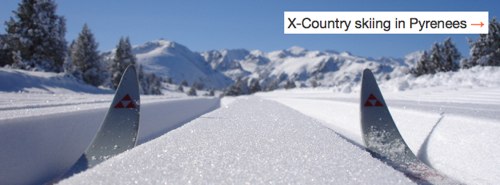
My early sketches involved very large, widescreen photos, and this detail was carried all the way into the final product. The widescreen format allows for some great detail of landscapes and panoramas, without the vertical overhead.
It also involves some tricky cropping mechanics. Most cameras take pictures with a 4×3 ratio (landscape) or 3×4 (portrait). The site halves the short side and instead uses an 8×3 ratio. Therefore, when a user—in this case, a tour operator—uploads an image, the system prompts them to crop the photo to show the top, middle or bottom half (the Maths is more complex for portrait shots). This cropping is initially done by clever CSS, repositioning the image vertically behind the 8×3 slot. Once a choice is made, the crop is made server-side for improved performance.
Process
We designed and built Tourdust as an Agile project, in collaboration with our Rails dev partners, New Bamboo. I’ve discussed the challenges of Agile design on A List Apart, but I believe that despite a few teething problems mid-project (mostly a cause of us not allowing enough lead time for design), the site is better than we could have created under waterfall methods.
In particular, since the clients were still exploring the business space whilst the site was being built, the business model changed halfway through development. With waterfall, this would have been beyond the point of no return, but with Agile’s flexibility we were able to accommodate the new requirements with only modest difficulty.
We also found ourselves fulfilling a strategic role as well as just designing the site experience. Frequently this involved reaching into the realms of service design, advising on features, functionality and proposition. One of the outcomes of this liaison was that great swathes of functionality were cut en route. “Worry about it when you need to worry about it” became a useful answer for many scalability questions. I think taking these bold decisions gives Tourdust more focus and a better user experience.
Endgame
Lest I paint too glowing a picture, the site isn’t perfect. Had we had more time, there are dozens of tweaks we’d have made. Imperfection is usually a tricky proposition for designers, particularly so at Clearleft: we do believe the devil is in the details, and our work is usually subjected to high scrutiny. Despite this, we’re proud of what was achieved on a modest budget, and hope we’ve given Anna and Ben the best platform to make Tourdust a success.
Of course, it’s a potentially difficult time to launch a startup. The recession is likely to dent the high-end, luxury travel market, meaning the site’s primary focus is currently on local, UK-based tours. But I do think, if the range is broad enough to gain traction, Tourdust can emerge on the other side in a strong position. I also couldn’t think of better people to take on this challenge than Anna and Ben. People who’ve put everything on the line to follow their dream are an inspiration, and it was a pleasure working with them. They’re true travel geeks and I think their confidence and love for the field will stand them in great stead.
Of course, it’s also down to the users, so I’d encourage you to have a play and I’d love to hear any comments you have about the site.