Work in progress
I’m itching to get started full-time, but right now I’m having so much fun that a few more weeks is worth the wait.
Last year I strongly considered studying for an MBA. It turns out that self-employment is also pretty handy for plugging gaps in business knowledge. The empty spreadsheet column marked Salary still gives me the odd scare, but it was the right choice. I’ve even enjoyed the aspects that others advised would be a chore. Sales. Cashflow. Pricing. Tax and VAT (I repeat my advocation of the marvellous FreeAgent). Politely telling the bank I don’t need their gratuitous insurance. Learning to equate my time with earning potential. Some small mistakes, of course, but nothing serious.
My first major project is fascinating, working alongside smart, experienced people on a cross-device curation service that offers real potential. I’m learning a great deal and hopefully offering a lot too. But the book is still the thing. Client work now is a means of avoiding client work later, so I can dedicate myself to the role of full-time writer.
To that end, it’s great to announce that Designing the Wider Web will be published this winter by the good-looking folk at Five Simple Steps. Their previous releases are already staples of the digital design canon, and it’s marvellous to be working with a UK-based team so committed to quality.
I’m itching to get started full-time, but right now I’m having so much fun that a few more weeks is worth the wait.
On the road
After three terrific years, I’m leaving Clearleft next month.
Illustration by Chris Summerlin, from Undercover User Experience Design.
After three terrific years, I’m leaving Clearleft next month.
A couple of reasons, the most significant being that I’m about to embark on my second book. More on that soon. I’ve already endured the stress of writing while holding down a full-time role, and it’s not something I wish to repeat. Nor is it fair to ask an employer to tolerate my resultant irritability and wavering focus. And while Clearleft is a truly exceptional company, its size and flat hierarchy understandably doesn’t scale to my more grandiose ambitions. So I’m hitting the road of self-employment, in search of the freedom and flexibility that accompanies minor terror. I’m sad at the thought of leaving such a great team, but the time is right. “L’audace, l’audace, toujours l’audace” and all that.
Although it’s tempting to don the disguise of lonely, starving writer for a few months, I’m too pampered. So I’ll be looking for a few choice freelance projects to pay the rent and preserve my modest savings. After the book, I have no plans. Maybe self-employment will suit me, or I may choose to look for the right permanent role. Somehow, the fluidity’s comforting.
I’d be grateful if you could spread the word of my freelance availability from 31 May. Ideally, I’m after short (1–4 weeks) interaction / UX design projects that pay respectable senior-level day rates. See LinkedIn for my up-to-date CV. If you have a project that may suit, please let me know at email@cennydd.co.uk. Similarly, if you have an interesting long-term prospect, including permanent roles this winter, do get in touch. My options are open.
Finally, keep an eye out for the book. With any luck, it’ll be worth all the effort.
Reflections of the United States
The differences are of course what hit first. Excess everywhere: vehicles, meals, distances, welcomes. Entire lakes and governments frozen solid. March Madness and marching protesters. Water towers emblazoned with logos – small towns as mock corporations.
At last, a moment to consider my time in the States.
The differences are of course what hit first. Excess everywhere: vehicles, meals, distances, welcomes. Entire lakes and governments frozen solid. March Madness and marching protesters. Water towers emblazoned with logos – small towns as mock corporations.
But the differences soon fade, and this time I finally understood some of the majesty of the USA. The way the shadowy yellows and greens meet the blue on the interstates. The deep greys, reds and sirens of the cities. Washington DC a nuclear lab, clinical, glimmering, and armed to the teeth. New York City all contrast and emphasis. The Chrysler Building, chubby around the hips and ever demure in the presence of its broad-shouldered cousin. Madison the desperate fighter, knowing that one more defeat could spell the end. Chicago with its perpendicular cold and rattling metal backbone. Denver’s thin air and stadium lights stretching to sawtooth horizon.
Galleries, museums, monuments, and a blur of local beers: Fat Tire, Spotted Cow, Daisy Cutter, 312. Inexpressible hops and malts and sweetness and sweat. I lurk in the hotel bars and Starbucks porches, dipping into the digital water before climbing back onto dry shores. My habit of using the iPhone weather app as an anchor to home is barely needed. I know that the UK is creeping toward double figures while the US careers between sunburn and hailstones.
The longest and shortest month of my life. Some day I’ll stay longer; perhaps even for good.
More on IA Summit 2011
The closing plenary speaker has a rare mandate: to pause, take stock, and think deeply about the future of our industry. It’s an opportunity I wouldn’t have otherwise had, and if you gained something from my talk, the organisers should receive their share of the thanks.
The reaction to last weekend’s IA Summit plenary has been gratifying. Thanks to everyone who listened, read, and shared. If you’ve not got round to reading it, don’t worry – a podcast is in the works. I’ll post a link when it’s ready.
I’ve been particularly pleased to see people pondering my words and responding with thoughts of their own (Loren Baxter, Minu Oh, Jenifer Tidwell). For many people, the talk struck a chord – for some, it caused debate. I’m glad; this means I interpreted the brief well.
However, much of the credit must lie with the IA Summit itself, and the people behind it. The closing plenary speaker has a rare mandate: to pause, take stock, and think deeply about the future of our industry. He or she is offered a platform to speak not only to the people in the room but to the wider industry. It’s an opportunity I wouldn’t have otherwise had, and if you gained something from my talk, the organisers should receive their share of the thanks. This year’s Summit surpassed almost any conference I’ve attended (and I’ve seen a few). Now’s a good time to mark your cards for next year: 21–25 March in New Orleans.
The fall and rise of user experience
A transcript of my closing plenary at the IA Summit 2011 in Denver, Colorado.
A transcript of my closing plenary at the IA Summit 2011 in Denver, Colorado. An audio version is available on the IA Summit website.
My user experience career began in 2002, when my government employer asked me to organise its hefty information stocks, and look for ways to publish them on its lousy website.
I started hunting for inspiration and, like many others, found it in the polar bear book. It was a hallelujah moment. At last, I’d found people who thought the way I did, and who shared ambitions that stretched far beyond my peers’ limited vision of the web.
As the only IA-curious person in my company and perhaps even my entire city, I led a lonely professional life. Denied the comfort of like-minded souls, I lived vicariously through blogs, Boxes & Arrows articles, and write-ups of events like the IA Summit. It meant that I knew many of you before you came to know me; and I thank you all for helping me survive and grow as a solo practitioner. Your advice paid off handsomely, and people have now been paying me to do what I love for nearly a decade.
So I feel a tremendous warmth toward the community that helped me so much back in my formative years. But I still think of myself as a relative newcomer to the global UX community. This is just my third IA Summit. I’ve been an outside observer to the history of IA and the Summit itself. The politics, the folksonomic uprisings, and the definitions arguments were read-only experiences for me. I had my hands full forging a path of my own.
Today, I work as a consultant, advising corporations, startups, and non-profits alike how to thrive by putting people at the heart of their thinking. My fellow consultants will recognise that one of our most powerful advantages is the naive viewpoint. We can ask dumb questions and give our honest opinions on how things look to the untrained eye, before we become embedded within the politics, language, and mindset of our client.
That’s the angle I take today. Working in a different country and being part of a different community, I’ve faced similar but different challenges to many of you. So I hope I can offer a fresh perspective on things: the view from my neighbouring hill.
I’d like to talk about the fall and rise of user experience.
The mainstream
User experience design has reached the mainstream. Senior executives who used to view design suspiciously – something practised by tall Europeans with thick glasses – now hear about user-centred design in publications like BusinessWeek and the Harvard Business Review, and at events such as TED and Davos. Now the economic clouds seem to be thinning, companies are looking to design to provide competitive advantage. Seeing the success of design-led products and the failure of those that neglect it, executives naturally want a piece of the action.
Apple is the poster child, of course. It has been voted Fortune readers’ Most Admired Company for the fourth year running, and thousands of businesses want their products to “be the next iPhone”. Although there’s still a substantial gap between aspiration and execution, business leaders are at least now talking about the right things: experience, prototyping, design strategy, innovation.
Public awareness
Public understanding of design is also growing. Customers see and use the same desirable products, and can now use the power of their networks to learn about a product’s true quality before they part with their cash. This means the public increasingly appreciates the value of usability and user experience, although they would never use those terms.
Ten years ago a struggling usability test participant would say she didn’t understand the system; but today she will give up in exasperation and lay the blame firmly at the feet of the designers. Many people now base technology choices on user experience, and choose long-term service providers based on their customer service.
Taking advantage of this new design literacy, some companies now promote UX as an important selling point. Recent British TV ads from technology companies, banks and price comparison sites all feature user experience above all; a welcome change from boasting about feature overload or relying on glamorous brand associations.
Catalysts of change
The world also increasingly sees information and technology as catalysts of change. Both are making a impact on global business, law, privacy and government. The costs of mass action have plummeted. Today’s connected youth are adept at using technology and the instant propagation of information to address what they see as flaws in the world. As we’ve seen in the first few months of 2011, networks are beginning to demolish hierarchies.
These are boom times for those of us who work at the intersection of technology, information and experience. The job market for people well-versed in UX and IA is bullish; even the world’s top tech companies can’t find enough high quality employees, and recruiters are becoming desperate with their flattery. It’s a candidates’ market, and if you aren’t in the job of your dreams, perhaps it’s time to consider leaving.
Trouble ahead
But there’s trouble ahead. I think the next couple of years will be tough for the user experience community. Partly this is a natural correction to our success, partly it’s a result of our expansionist tendencies. Either way, we’re slipping toward the trough of disillusionment.
Pollution
Our most pressing problem is that of pollution. The user experience discipline has become so broad that anyone can now legitimately claim to practice it. Literally every designable object or service engenders an experience. However, its most common interpretation is narrower. “UX” is fast becoming the latest synonym for “web design”.
The explosion in our industry’s influence, pay and respect is devaluing our chosen term and causing looming quality problems. Since demand far outstrips supply, web agencies and freelancers alike have created a landrush to the UX term. The skills that underpin the work have often been left aside in the melee.
Some truly ill-informed companies and people now provide truly mediocre services under the label of user experience design. I’m embarrassed by some of the nonsense that these UX cargo culters spew, and I struggle daily to decide whether to bear my teeth to it, or accept it as The Way Things Will Be From Now On.
Don’t misunderstand me; I welcome genuine entrants to the field and have mentored smart, dedicated people over several years. However, even among the brightest newcomers I see a worrying trend. User experience converts are typically drawn to the glamour of interaction design on shiny technology, and the amateur psychology that helps them sound authoritative about their approaches. Most lack knowledge of basic information architecture, design theory and elementary programming skills.
The pollution of our field was entirely foreseeable, and user experience design is by no means the first community to face it. The mainstream transforms any idea it seizes, much to the chagrin of the pioneers, who grumble on the sidelines that they’ve been misquoted.
There aren’t any easy solutions. Chartership crops up every now and then, but here I must disagree with Jared: I think it’s a non-starter in our field. No organisation is suitably placed to offer it, it would introduce a huge overhead to an industry founded on accessibility and simplicity, and it could mark an unfortunate return to the ivory-towerism that plagues our more elitist tendencies.
Backlash
The backlash is coming. Some of our colleagues and prominent members of the tech community now decry the user experience label, claiming we simultaneously promise the earth yet overpromote novice staff into roles they can’t handle. Our abstract vocabulary makes for a particularly soft target. Let’s be candid: “user experience architect” is as conceited a job title as the century can boast.
To our detractors, user experience design is nothing more than the latest fad, a trivial exercise of listening to users and giving them whatever they ask for. We refute their claims of course, but like Hydra, a new head soon grows in its place. Even some of the people we should be closest to – content strategists, business analysts, visual designers – have begun to feel squashed by the UX juggernaut. They’re forced to defend their territory: “No, we’re not part of UX”.
Factions
One natural reaction to overexpansion and external threats is to retreat into groups. This offers some benefits to the group, particularly around the gestation and discussion of deep concepts. It can also be abused for personal gain; simply plant a new flag and proclaim yourself king.
I won’t dwell on the factions within user experience, as it’s a well-trodden path, but suffice to say, factionalism has done more harm than good. It has created politics and power struggles, not to mention the ludicrous situation where three professional organisations vie for the attention of virtually the same people. And territorialism doesn’t reflect real design; you can’t divide such a slippy, amorphous thing into neat boxes. IA challenges, for instance, are almost always bundled up within larger design challenges that involve interaction design, visual design and technical execution. Swearing an allegiance to just one discipline limits one’s ability to see a problem through to its conclusion.
Stagnation
Instead of driving specialisation, fragmentation actually promotes stagnation. If the IAs dig into the IA trench, and if interaction designers retreat to their interaction design bunkers, both become weaker. Interbreeding magnifies flaws as well as strengths. In fact, I level the same accusation at the entire user experience field.
In my early teens, I started listening to bands like My Bloody Valentine and Slowdive, who’d started to form a strong alternative music scene. These bands stuck together, attending each others’ gigs and playing on each others’ EPs. The British press gave them the droll label “shoegazers“ for their habits of staring at the floor and not acknowledging the crowd. But later, a more unkind label emerged: The Scene That Celebrates Itself.
User experience design risks becoming the scene that celebrates itself. True, every burgeoning movement needs cheerleaders, but in our eagerness to revere our comrades we can overlook what really matters: do we matter? Have we released that world-changing album? Are we as important and effective as we think? I’m not so sure. Forrester’s #1-rated firm in customer experience – Borders – just went bankrupt. Admittedly, it’s wise not to take Forrester’s word as gospel, but there are dozens of factors that affect business success. User experience is an important one, but a crisis in cashflow, pricing, or hiring will overwhelm it.
I increasingly believe that the UX community has had at best a modest impact on our most common medium: the web. The world’s most successful sites are mostly those with great business models, good marketing, or critical mass. Some are well designed. Plenty are not. Instead of user-centred design causing innovation to spring forth, commoditised and patternised sites dominate specific verticals like e-commerce or news. We’ve even reached the point where research suggests the public expects mobile apps to be easier to use than the desktop web. That’s an astonishing revelation, since the inherent constraints of largely immature mobile devices present substantial impediments to good experiences.
Global outlook
Finally, I feel we’re not only too inward-facing, but too local-facing. The UX community is still sadly US-centric. I’m told I’m the first non-US citizen to close or keynote the IA Summit – a tremendous honour of course, but one that shouldn’t have taken twelve years.
The global community may not have thrown up big names to rival those the US can boast, but the work is strong. Some European nations in particular are doing great things, and as is her custom, Europe has been doing things her own way. Professional organisations, for instance, have had little impact in Europe. In the UK, all new community activity has been down to private organisations and passionate individual activists: London IA. UX Brighton. UX London. UXCampLondon. Design Jam. UX Bristol. Northern UX.
Remember that just 90 years ago my nation was the dominant force in the world. Power changes with time, and we can no longer afford to look only at our closest neighbours. A truly global practice will teach us a huge amount about new ways of seeing the world and our discipline.
The way forward
Clearly, we face problems. Fortunately, we’re natural problem solvers, so let’s look at how we can negotiate the territory ahead.
‘Labelism’
First, it’s time to abandon of one of our most harmful addictions: labelism. As if our definitions weren’t complex enough – usability, IA, interaction design – now user experience is joined by service design and customer experience, which are identical on all but the most pedantic levels.
In Memphis, Jesse James Garrett gave an adaptive pathology of the IA disease and proclaimed the end of the Information Architect label. I’ll go one further and predict that the User Experience Designer label will also cease to be useful within a couple of years. It’s been a decent epithet to rail against short-sighted, user-hostile practice, but its shortcomings are becoming all too apparent.
But I don’t advocate any specific replacement. A label is a personal choice about one’s boundaries and comfort zones. I’m not saying we should choose sides. I’m saying we should stop playing the game.
We shouldn’t feel threatened or sentimental about labels. The disciplines within UX design are here to stay, and have gained sufficient maturity to become a competency within all forms of design, not just the domain of one group of practitioners. Our skills will always matter, and we will always design good experiences. So I don’t care what you call yourself. The work is what matters. The label is just metadata.
Focus on delivery
Rather than explain our expertise through process and terminology, we should point at our output. If we are indeed worthy of the praise we’ve been receiving, our outputs had better be demonstrably better than others’. Otherwise, perhaps our detractors are right.
Putting this kind of faith in our work takes dedication. It means we should stop fetishising trivialities – the ideal iPad stylus, “gamifying” our interfaces – and replace them with unwavering focus on the end product.
Of course intellectual curiosity is healthy: it helps us refine our philosophies and add new tools to our armoury. I also appreciate the irony of using a keynote speech to denounce pontification. But there are glaring problems right under our noses that demand attention. Managing digital identity. Helping people control privacy in a connected world. Finding ways for people to take their digital lives with them between devices. Address those and we’ll truly deserve our praise.
This focus on delivery must underpin everything we do. It’s understandable for designers to want strategic roles, as we encounter tactical limits. But in claiming the territory of design thinking, we must never forget the design doing, where true craft and talent turns thought into results.
Consider ethics
If we focus on our work, we must also focus on the value our work has to society. As the user experience field has matured, it’s saddened me that our discussion of ethics has been so flimsy.
We’ve had great success recently by framing UX as a way to influence users to do things our employers like: buy more things, sign up for things, and come back more often. The idea of using psychology to persuade is hardly new. Advertisers have been doing it for years, and it’s a hot topic within the public sector.
Some of the cases for persuasive design are convincing, particularly where the desires of both user and persuader overlap with clear mutual gain – energy use, financial prudence, weight loss. But there are questionable applications, and some so-called UX designers use persuasive design solely for the benefit of the company they work for. It’s a terrible waste of our potential. Of course we need to please the people who pay us, but we must also examine our impact on the world.
Question value
Nearly 50 years ago, a group of graphic designers led by Ken Garland wrote a manifesto called First Things First. In this piece, they bemoaned the design industry’s focus on advertising trivial goods, and its neglect of other fields that included education, book design, and wayfinding.
It’s time for a similar reappraisal within the digital design community. I’m not just talking about advertising; I’m talking about questioning the value of everything we create.
At this year’s Consumer Electronics Show, manufacturers unveiled 20,000 new products, including some 80 tablets. In the words of Helen Walters, who reported on the event, that’s not innovation, “it’s vandalism“.
The world doesn’t need another Groupon clone or more Snickers bars. They add no value to the market or the people that make up that market.
Instead, the world needs fewer, better things. Things that work beautifully. Things that are humane and reliable; that help people to do things they never thought possible. That’s our natural territory.
You may argue – and many will – that a UX designer can still have a meaningful career creating more marginal services or advertising commonplace products. That’s your call, but I ask this – which eulogy do you prefer: “They really shifted more units” or “They really made a difference”?
Gaining influence
So let’s talk about making a difference. The first step is of course to design the best products and services we can. But this is mostly going to have a local effect; grand ambitions require influence.
This is a familiar concept to both the community and the Summit. JJG predicts that a UX designer who rises to the level of CEO will be unstoppable. Last year, Whitney Hess urged us to look outside our community and engage with the business world.
Attempts to date
To date, we’ve mostly tried to gain business influence by adopting (or at least simulating) a business mindset.
We talk about design as a way to improve customer loyalty, garner referrals, and reduce risk. Learn deeply about the customer first and you’re more likely to get it right. We present design as something that can be analysed, controlled and adjusted through iteration, A/B and multivariate tests, usability testing and so on. We try to quantify our efforts, so businesses can see we’re not just hand-waving “creatives”.
Design and science
I trained as a scientist. I’ve studied a great deal of mathematics and statistics. I know their extraordinary power and beauty. But I also know their limitations. Numbers are valuable advisers, but tyrannical masters. Design is an act of visual prediction. Its nature demands investment with uncertain returns, and there’s no way to disguise the leap of faith that requires.
Design isn’t science. Repeat an experiment – a design approach – in different circumstances (different users, different year, different culture) and you’ll get different results. So numerical targets should never be the primary goal of design.
We aim to create things that are inherently unmeasurable: experience, utility, pleasure. There’s been lots of talk this weekend about measuring these things, but I’m afraid I think it’s largely wasted effort. The best we can do is to scratch a chalk outline around their shadows.
But do we really need to measure? The idea that “if it can’t be measured, it doesn’t count” is one of the most damaging delusions of our time. It gives us a world that rewards quantity, not quality.
Make metrics the core goal of your design and you’ll just end up with design that optimises those numbers, at the expense of other important qualities. The UK public sector has been paralysed by excessive goal setting, and the new right-wing coalition is using that as an excuse to gut the whole sector, claiming it’s not functioning properly. Of course it’s not functioning properly!
The numbers of capitalism are almost all short-term – profit, year-on-year growth, yield – rather than long-term and sustainable. No wonder the tantric joy of user-centred quality often loses out to the instant hits of promotion, discounting and resource depletion. The metrics make it so.
A new angle
There’s a serious risk that in trying so hard to please businesses, we lose what makes us different and valuable. Our understanding of intangibles and abductive reasoning, and our long-term vision are different, but hopefully complementary, to the deductive, analytical skills prized by MBA professors and economists.
I think the problem of getting business to understand design is better revised than solved. Systems thinkers will tell you that repeated patterns of behaviour are the result of the inherent structure and rules of the system. Economies expand and contract naturally because of their structure and rules. Bad companies produce shoddy products and services because of their structure and rules. So if we want to change how these companies work, we must change their structure and rules. Adding another UX designer to the team or switching to a more efficient wireframing tool is a weak point of leverage.
We need to change business, not become it. Rather than fit design into the current corporate model, we should build businesses in which customers are the focus, not costs. In which creativity beats control. In which we understand risk, not excise it. In which good questions are as important as answers. In which we make things that matter, not things that clutter.
Obliquity
The economist John Kay claims that the world’s most successful people and organisations achieve complex aims through obliquity – that is, by pursuing something else. The most profitable companies don’t just try to make a profit. The most powerful people don’t just pursue power. They all pursue a greater purpose, be that serving a country or advancing a field.
Designers know obliquity well. It’s our watchword. We know that to get the girl you don’t follow her everywhere she goes. You get the girl by being an attractive person.
The single-minded pursuit of profit has given us economies of fraudulent fiction, in which some companies would rather forge their balance sheets through obscure accounting than make useful things. Even the governor of the Bank of England acknowledges that banks have imploded because they put short-term profit above customer interests. Some mobile operators now seem more interested in restricting customers’ bandwidth than building capacity!
Given the disastrous consequences of these approaches, let’s hope that the 21st century sees obliquity triumph. Let’s hope companies will again try to profit by creating valuable things, not just protecting their targets or the complex rules they’ve set themselves.
The golden rule of UX
This is where we can have true influence. Today, I propose a Golden Rule for our industry. The purpose of user experience design is to create personal value.
We’re not here to reduce risk. We’re not here to massage conversion rates. We’re here to make things that improve people’s lives. In doing so, our companies profit in both senses of the word. It’s insufficient to judge our industry by the ROI we generate, or our contribution toward GDP. We should judge our industry by the happiness we create.
Call me an idealist if you like. It’s easy to dismiss idealism as a flaw of youth; to think it’s something we grow out of. But idealism is obliquity, and without it the world would be a wretched place.
Beyond modernism
I don’t believe it’s such a far-fetched vision, and we’re seeing similar shifts across many domains of design and society. Modernism, with its growth, technology and speed, was the driving force behind the 20th century.
Now, we’re seeing the green shoots of another movement. One that puts humanity back into capitalism, and thrives on locality, diversity and service. It’s a movement that favours meaning and value to mere functionality, and prefers well-paced long-term investment to a fleeting return.
Michiel Schwarz and Joost Eiffers have put forward the name “sustainism” for this movement. An awkward title to be sure, and obviously I’m not terribly interested in the label, but perhaps a new approach does need new language. Because modernism isn’t going to help us navigate the next three decades. It’s clear that the mid-term future is going to be dramatically different to what went before.
The changing world
Millennials across the world are rebelling against the inequality created by the baby boomers. The new generation is of course notorious for wanting the world and its responsibilities today. The older generations tell them to wait their turn; but that defence isn’t going to hold for long. The world is becoming bottom-up, not top-down.
Power, capital, and influence will shift from North America and Europe to the BRICeconomies: Brazil, Russia, India and China. Shortages of energy and resources will mean that technology will be crucial to our survival, let alone our commerce and leisure. A great deal of the world will have to be re-engineered around the needs of communities and citizens. We can be central to this movement; in fact, I’d say it’s our moral obligation.
Subversive UX
It’s tempting to view the theme of this year’s IA Summit – “Better” – as a plea for incrementalism, but I think we need to be braver. Challenging accepted ideology takes courage. But to quote Marty Neumeier, “quality is an act of rebellion”. We need a new band of rebels.
We already meet the job description of the innovative business leader. We’re versatile, happy working with the minutiae of pixels and interactions as well as vision, strategy, and systems. We connect dots that others don’t, examining details across an entire experience. We can discriminate weak signals and hear unvoiced demands. And we have a foot in the multidisciplinary door, with years of experience as translators and arbiters between technologists, users, product teams, and marketers.
We should know how to play the corporate game, but also know when to subvert it. Sometimes we should make a rational case for why designing for users is desirable. But sometimes the correct answer is simply “Are you fucking kidding?”.
Because we ask difficult questions, some businesses will label us “difficult to work with” and resist our efforts. These are the companies that are ripe for disruption. To be blunt, some companies are not worth saving; their structure and rules are antithetical to creating good user experiences. But plenty of their competitors will welcome intelligent insight, something we can offer in abundance.
Leadership
Influence and leadership are within our grasp, if we can be bolder. The path of least resistance is to wait for companies to see our value and create new executive roles – Chief Experience Officer, Chief Customer Officer. But every discipline thinks it’s entitled to a C-level slot. Despite what Forrester may say, it won’t happen at any scale any time soon.
So if we want to rise to positions of senior influence, we should be open to alternative routes – product management, marketing, even technology – in which we can use design as a lens to innovate, and spread the infectious message of user-centricity from department to department.
Know our limits
Advocating a higher purpose is rousing keynote stuff, of course. None of us needs to be told to do good and make a difference. We’re already wired that way. Our values and attitudes are largely what’s drawn us to this field.
But we must also know our limits. The humility and pragmatism of today’s practitioners is an important reason for our increasing influence. It would be a disaster for the UX community to believe its own hype and succumb to arrogance.
As we step into new territory, we must retain some humility. We should know when to disrupt and when to simply listen. We should acknowledge that other great minds have tackled these issues, and respect the professionals and thinkers who have paved the way before us.
What’s next?
Today I’ve urged our community to transcend trivial commercialism, but cautioned about the danger of hubris. So I suppose I’m advocating the middle ground. Rational radicalism. Ambition with humility. How terribly British of me.
For me, the future of UX is multidisciplinary and pluralist. User experience design can co-exist with other disciplines. It need not subsume them, although it should definitely subvert them.
Instead of building walls around our domains, we should chase problems and their solutions where they lead, defying the disciplines. Along the way, we’ll encounter other people who think the same way and share our oblique mindset.
These partners, whatever their discipline, will prove just as valuable allies as our friends in this room. When we hit problems that design can’t solve – and there are plenty of them – we’ll have allies who can help us navigate around them.
A possible future
I’ve painted a picture of the user experience leader, but I know that’s not a role that will excite everyone. Practitioners are the heart of the discipline. So allow me to close with some speculative fiction; a view of all levels of our industry in a few years.
The phrase “user experience” still has currency, but it has become a frame of common reference rather than a job title. The principles of UX have seeped into the bloodstream of every competent designer.
Some of us ply our trade outside the digital domain, designing entire services in eclectic domains. Others prefer to scope their work to specific products and media: digital, web, and so on. However, any gap between the two approaches is diminishing. The distinction between products and services is breaking down, and most non-trivial products have a digital service component. Very little exists purely offline.
It’s likely we’ll look back with a wistful eye at today, the heyday of the UX community, before its scope and scale became too big for cohesion. And many of us will look back fondly at the free, open web, created by visionary geeks to encourage free information flow. Instead, we’ll see a landscape in which the walled garden has returned, the web browser has failed in its quest to become the One True Platform, and regulation and privacy abuses by governments and corporations are more dangerous than ever. But digital technology will have finally come of age as its own true medium, straddling devices and channels, and seeping into people’s daily lives in hundreds of ways.
The most interesting and complex problems of this era involve information architecture. The promises and theory of ubicomp are finally starting to become real, in their own nascent, clunky way. As the world’s devices, data and people become ever more linked, there’s a huge amount of IA being practised. Not many people are calling it IA, but that’s ok. The work matters.
Is there an IA Summit? I don’t know. But there is still a thriving community of people tackling these challenges, and amid the frustration and head-scratching there will be genuine breakthroughs that help people construct, understand and inhabit information spaces in exciting ways.
As the practitioners explore the frontiers of the industry, somewhere, a passionate UX designer in this room today – or perhaps in another nation, oblivious to these words – has risen to be the CEO of a company other than a design firm. And they are systematically kicking their competitors’ arses. They’ve pulled together overlapping fragments of customer understanding into holistic, well-understood bodies of knowledge, just as Louexplained yesterday. They’ve tried to create personal value rather than profit, and are now being rewarded with both. Few people outside their specific vertical are paying much attention right now, but before long they’ll be swamped by people wanting to know their secrets. A global swing to the mindset of human-centred, sustainable business is underway.
Close
Despite the difficult territory ahead, this community makes me optimistic for the future of technology and even the world. It’s a thrill to be among such deeply intelligent, passionate people and to share my thoughts on the future of our industry, and I thank you all for this opportunity.
A calmer reading app
I’ve been thinking about how reading apps could take a different tack. How they could be calmer.
For me, 2011 is the year of the reader. Essential technologies such as pixel density and screen typography are at last reaching comfortable standards, and after years of being treated as mere eyeballs and drivers of ad revenue, users finally have tools that help them regain control of the reading experience.
On the surface, tools like Instapaper, Safari Reader and the updated Readability are simply the logical continuation of the separation of presentation from content. However, I see them as embryonic oracles of the era of content shifting, in which users will push text, photos and videos between devices and contexts far removed from their current habitats. There will be substantial implications for publishing, information architecture, advertising, and design, which I’ll discuss in a future article. But for now, let’s look at the applications themselves:

Instapaper has become an essential part of my digital life, and I’m intrigued by the promise of Readability, above. However, I do feel the current crop of reading applications take too technical an approach to the art of reading. So much of our digital lives is spent pushing undone tasks from one service to another: emails to Things, RSS to a sprawling folder of “Unsorted bookmarks”. You’d be forgiven for thinking that the modern digital native is mostly concerned with reducing big numbers to zero.
So I’ve been thinking about how reading apps could take a different tack. How they could be calmer. How they could leave the to-read pressure behind and restore some enjoyment to reading. As a thought experiment, I’ve been sketching some thoughts on a hypothetical reading app: let’s call it CalmReader.

The primary design principle of CalmReader is that users should feel empowered to go with the flow, not to fight the tide. Don’t try to read everything, but do read something. CalmReader should be seen as a scrapbook, not a to-do list. Users should be encouraged to add as many articles as they like without fear of guilt at not reading them; with a Readability or Flattr-esque micropayment mechanism underlying the app, this is obviously good news for publishers.
CalmReader has no unread count. Unread counts suck the joy out of life, and the trivial pride of reaching zero is quickly crushed by inevitable new tasks. Unread counts are tolerable within to task-orientated environments like email, but within a reading application they reinforce the undesirable mentality of Keeping On Top Of Stuff, rather than enjoyment.
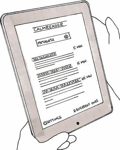
An estimated reading time accompanies each article, calculated from its word count. It’s harder to estimate the scale of a digital work than its physical counterpart, since we can’t skim to the end or feel the paper it’s printed on. The reading time estimate helps users to fit reading around their schedules, reducing the chance they’ll have to abandon an article halfway through. It also promotes the understanding that it’s OK to graze on short articles. Reading needn’t be just about marathons of concentration.
Article ordering is particularly important to CalmReader. The reverse chronological order – newest on top – seen in Instapaper and Readability doesn’t suit the calm mindset. Since newer articles persistently suppress older articles, reverse chronology risks creating a backlog of articles that you never get round to reading. Thus reading becomes equated with embarrassing procrastination. Instead of the full backlog, CalmReader shows just three articles when opened, guided by an algorithm that balances randomness, popularity and recency (more on that below). It displays the first few sentences to jog your memory and help you decide, but if these articles don’t take your fancy, tap the Different ones link and it will refresh the list.
This cherry-picking approach is deliberately non-comprehensive, meaning that CalmReader acts more as a reading suggestion service than a library of everything you’ve bookmarked. One downside of this approach is that it potentially hinders findability of specific articles. Scale exacerbates the problem: if you’ve added hundreds of articles, a graphical interface soon becomes cumbersome. Therefore, search plays a central role in CalmReader. Users can enter a search query to help them find a specific article (“Bahrain”), or to find articles that contain topic keywords of interest at that moment (“sport”, “design”, “pop”). To add richness, CalmReader adds hidden tags to each new URL (using the Delicious API, for example) – so a topic-based search like “Middle East” still retrieves articles that don’t feature the specific text.
We might also use APIs to harvest popularity metadata from social services such as Tweetmeme or Reddit. CalmReader then displays a simple preferences screen to allow users to give gentle weighting to either popular or lesser-known articles, for users who want to stray off the beaten track. Users can also bias the selection algorithm toward older or fresher material. This potentially complex weighting algorithm is largely hidden from the user. No need to expose the inner workings; it’s a simple reading app, after all.

So there we have it: just an experiment, and not one I’ll build (feel free to build it yourself if you like – ideas are cheap). But it’s interesting to consider how a few small design tweaks might fundamentally affect the nature of reading applications and remove some of the guilt that lingers around them. The world could use a little less stress.
UX writing retreat
Our mobiles have latched on to the French networks and pushed our clocks onto continental time. An hour lost, an hour gained, it doesn’t matter. Time is unimportant here.
I write this in the lounge of a grand house overlooking the English Channel. The architecture feels faintly colonial: three balconies, high ceilings and flaking white paint. Our mobiles have latched on to the French networks and pushed our clocks onto continental time. An hour lost, an hour gained, it doesn’t matter. Time is unimportant here.

And that’s the point. Eight of us have gathered here for a long weekend to write and to think. For some, it’s a chance to blog. Others plan larger projects. We try to ignore the WiFi and instead discuss information architecture, mentoring, and the job market. We talk about our favourite books and bemoan the lack of unbridled joy in design literature.
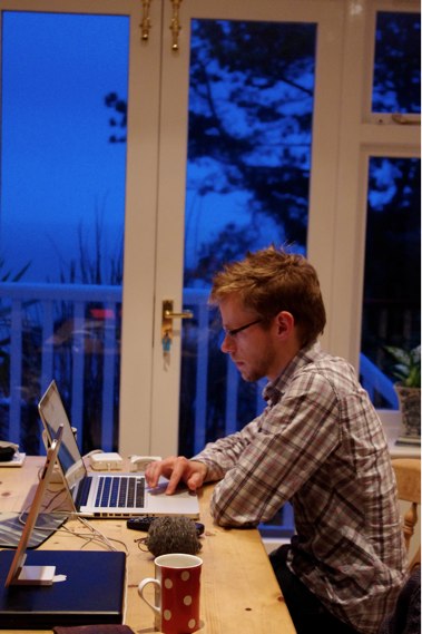
The sound of the wind and the waves is indistinguishable. Of course we chose February to save money, but I’m keen also to embrace the bleak romance of the English winter. It’s a suitably wild and blustery weekend and, once we find the thermostat, we huddle together over glowing rectangles and cups of tea. Various tools of the trade emerge: Scrivener, WriteRoom, Writer, Ommwriter, TextEdit. iPads, PCs, Macs, pens and paper. In the evenings we seek out the local pubs, armed with flashlights, obvious tourists in this quiet village.
It’s a somewhat melancholy wind-down as people drift away early to prepare for a week of work. (In retrospect, a Monday off is too easy to sacrifice.) I watch the ferries slither to the West and debate whether that’s Calais I can see, or just a watery horizon.

It’s been a successful weekend. A clearing of the cobwebs, and a chance to slow down and create without distraction. We need more of these downtempo moments.
Attendees: Cennydd Bowles, Matthew Solle, Ian Fenn, Mags Hanley, Tyler Tate, Ann McMeekin, Amanda Wright, Sjors Timmer
The role of taste in design
My theory is that, as in chess, “taste” is simply the ability to draw on patterns and experience to help us choose better candidates for analysis.

Photo by All Glass Photo.
While other teenagers chased the opposite sex and drank their parents’ cider, I played chess. Bobby Fischer was my Holden Caulfield; a gifted but flawed antihero. At university, my chess career dropped off as I caught up on the excitement I’d missed, but the mark was made, and I still play from time to time. I’ve even played a few Grandmasters, with little success.
Most people think that Grandmasters are stronger players because they “see further ahead”. It’s true that they examine branches of play more deeply than the average player, but the difference is slight. A couple of moves perhaps, but not enough to explain the gulf in skill.
Instead, the main difference is that strong players instinctively select good moves to analyse in the first place. Somehow, masters screen out bad moves without the need for deep analysis. Ask these players to explain this process and they struggle – all they can say is that they intuitively knew certain moves were more promising than others. It’s as if skilled players have developed “taste” for chess moves.
Psychologist Adriaan de Groot’s studies show that the process of playing chess is more akin to the design process than to mathematical reasoning. Both chess and design revolve around visual memory and spatial reasoning. Both involve a phase of orientation, exploration, investigation and validation. And both have enormous branching factors. The permutations of design are limited only by constraints and imagination, while the number of chess games of just three moves each numbers over nine million. De Groot explains that the discernment showed by skilled players is closely related to pattern matching. Grandmasters are thought to have learned up to 100,000 chess patterns and moves, which helps them to develop a feel for the right move in the circumstances.
So what role does taste play in the design process? My theory is that, as in chess, “taste” is simply the ability to draw on patterns and experience to help us choose better candidates for analysis. As such, good taste improves efficiency. An experienced designer doesn’t waste time on clearly ineffective solutions: typographically poor designs, bad colour choice, or unusable interaction metaphors. It follows that taste is learned, not innate. Experience, exposure, and practice give us patterns that suggest which solutions might fit which problems.
There are, however, more cautionary interpretations. Some critics and philosophers contend that taste is merely an exercise in reinforcing social hierarchy: the upper class has taste, the middle class aspires to it, and the lower class lacks it. According to this theory, “taste” is a value judgment about what is beautiful, desirable and proper in the world.
This leads us to the troubling thought that perhaps professional designers perpetuate their existence by claiming that only they possess taste. To avoid this elitist trap, we must expose ourselves to variety in design. This means embracing the low brow with the aristocratic, the kitsch with the refined, the masculine and the feminine. We should let go of the notion that only a designer can produce a tasteful solution, and revel in the ingenuity of the hack and the quick fix.
Whatever the definition, taste alone isn’t sufficient for good design. Give a Grandmaster two hours to play a game and they’ll play substantially better than if you give them five minutes. Promising solutions must still be examined thoroughly. This analysis – visual prediction, updating our approaches as we find flaws or learn more about the features of the problem – is the heart of the design process. Anyone who claims that taste alone justifies their design is misguided if not arrogant.
Postscript
Several years after graduation, I grew nostalgic for the tick of the chess clock and joined a local league. A strange thing had happened. My grade, the quantification of chess skill, had leapt from a mediocre 79 to a respectable 125 (1700 USCF, for American readers). Yet I’d not practised, kept up to date with opening theory, or played more than a handful of one-sided casual games. How, in ten years of lapsed play, had I become a better chess player?
Now I know. I became a designer.
Further reading
Updating Nottingham’s tram graphics
Nottingham’s tram system NET is regarded as one of the most successful urban light rail systems in Europe. I commuted on it daily from its opening in 2004 until I moved away, and remember it fondly when stuck on an uncomfortable Underground journey.
Nottingham’s tram system NET is regarded as one of the most successful urban light rail systems in Europe. I commuted on it daily from its opening in 2004 until I moved away, and remember it fondly when stuck on an uncomfortable Underground journey.
Soon after its launch, I blogged about the information design of the tram’s timetable and fare posters, praising their skilful combination of clarity and information density.
Thinking about the project started what has become a deep interest in wayfinding and helped me appreciate the value of environmental graphic design: design that helps people navigate, communicates location identity, and shapes the idea of place.
Happily, the display’s designer Eleanor Seelig saw my post and contacted me recently to let me know that an update was in the works. I asked her for a few words about the project.
The first design was done a few months after the launch when the system was still very new to Nottingham. The brief focused on introducing the tram to Nottingham, but in a way that pitched the brand as higher class public transport. It was important to persuade people out of their cars and onto public transport by selling the benefits clearly. This resulted in a huge amount of information to include, which possibly became a struggle between usefulness and promotion. When I came to design the second version, the tram had just celebrated its sixth birthday and was now securely part of the landscape of Nottingham. In reviewing the existing design, it suddenly felt very cramped. Plenty of the information was out of date and, due to many small changes and the need to squeeze in yet more information over the years, not very clear.
You can see the new map in full at the NET website (PDF format). The update’s main goal has been to reprioritise information to suit users’ recent needs. The rapid adoption of the tram has meant that it is very familiar to Nottingham’s residents, with recent fare adjustments becoming of higher priority than line and geographical information. To save reprinting costs, some of the more rapidly-changing local detail has been omitted, and transport links have been rolled into the redrawn line map.
I knew the fare information was really quite complicated to communicate, with lots of ticket types and even different fares for different times of the day. So I used the coloured fare buttons to draw the viewer into to the fares that would be most relevant to them when standing at the stop – it’s a bit frustrating to find out how cheap a season ticket is when all you want to know is what it’s going to cost you today.
There were also several functional restraints to take into consideration. Each stop has its own timetable and because of the design of the system, this means that stops have between one and three separate panels of times. So I needed to incorporate some ‘filler’ information for certain stops. All in all, there are 46 stop boards, with 32 variations, so it’s a bit of a complicated job.
I was a fan of the open feel of the original version, and on a purely aesthetic level I preferred it to the more boxy and masculine update. I also think it’s a shame that the client has clearly pushed the design toward being a vehicle for promotion rather than information (the “Tram it!” campaign is somewhat ridiculous). But generally I think this is a decent user-centred update of an excellent design.
I’m happy to see that the stem-and-leaf timetable structure is still intact and I agree with the deprecation of local information. Interesting though it was, for the majority of city residents this information was simply unnecessary.
Finally, Eleanor’s copy revisions improve the instructional tone of voice, putting a more approachable face to the service.
I felt some of the information was a little too gruff and off-putting in its tone of voice, so I rewrote the ‘Using the tram’ panel to make it a little friendlier and less authoritative.

Bravo to Eleanor and NET for continuing to demonstrate how good design can make urban transport a little more accessible. I’m looking forward to seeing how NET will update its wayfinding and information graphics with the future introduction of Lines 2 and 3.
Content Strategy Applied in review
The field’s abstract leanings have attracted the attention of those who’ve considered content a downstream function, but have also proven too elusive for some. At last, we had a chance to see the nuts and bolts.
The practical direction of Content Strategy Applied, the UK’s first CS conference, was a smart move. The field’s abstract leanings have attracted the attention of those who’ve considered content a downstream function, but have also proven too elusive for some. At last, we had a chance to see the nuts and bolts.
The two days gave a wide view of the discipline, from a tour of the values, content and community of JamieOliver.com (courtesy of Monisha Saldanha and Danny McCubbin) to deliverable detail from LBi‘s Head of Content Julie Mahoney. Unsurprisingly, there were clear parallels with the early days of information architecture. Content strategists are gaining strength from recognising common ground and joining with others. The conversation is moving from stealth—“What is it you do again?“—to genuine influence—“We get it. Now what can you do for us?”. As such, the community’s challenges are familiar to any UX veteran: learning the language of business, demonstrating ROI, getting a seat at the strategy table.
The similarities extend from the communities’ lifecycles to the landscape under discussion. I’ll admit that my first instinct was to react defensively to the territorial issues. Should content strategists really do wireframes and layout work? Do they have the library and information skills required to create large site architectures? Aren’t these “content fails” you’re showing simply WebPagesThatSuck-era usability?
But there’s no need to feel threatened. Although CS and IA are approaching the same battleground, it is as allies. Our goals are largely indistinguishable, and once the armies meet we will better appreciate both the vocabulary and history of the other force: LIS and design on one side, writing and publishing on the other.
That’s not to say that friendly rivalry is out of the question. Keynoter Kristina Halvorson in particular has taken aim at the UX community’s content-ignorant approaches, and she continued by teasing the sacred cows of JJG and Tufte. All in good sport, but some underlying subtexts of the conference did make me feel less at home. Publishing and marketing reverberated throughout, with the word audience far more prevalent than user. Presenters spoke of how companies can present themselves through brand, messaging hierarchy, and calls to action, but there was less of what users need and want. User experience attendees were thin on the ground, and more focus on this angle next time would resonate better with the UX community.
With time, the community’s presentation skills will improve too. As expected the content was strong, but to be blunt, the design community has the CS community licked when it comes to compelling presentations. However, message is more important than showmanship. Content Strategy Applied tried to unite the nascent British CS community, share ideas, and inspire through good practice. Mission accomplished, and hopefully it can act as a stepping stone for the community to earn further influence.
The intangible brand
To paraphrase Marty Neumeier, a brand is the intangible public perception of a product or organisation. A gut feeling. A collective hallucination.
The use of “brand” and “company” as interchangeable words—“Food brand Kraft hires new Creative Director“—bugs me. My issue is not its association with flimsy new media marketese, but that it simply misrepresents the concepts. To paraphrase Marty Neumeier, a brand is the intangible public perception of a product or organisation. A gut feeling. A collective hallucination. A company makes stuff, but people buy because of the brand.
My bonus definition: a brand = user experience + non-user experience. It seems to work well for me.
(Suffering from bloggers’ disease lately: the paralysis that results from trying to reach the skies with every post. Expect more frequent snacking to accompany the main courses.)
The year gone by
Please indulge me for the customary year-end contemplation.
Please indulge me for the customary year-end contemplation.
I’ve recently returned from a family break in Cornwall; a chance to repay my sleep debt, help around the house, and rediscover the warmth of a novel. In quiet moments I watched a fox inch across the garden, wagtails bounce on the patio, acrobatic squirrels wrap their haunches around the bird feeder. Seems I’m becoming more sentimental about the natural world as I get older.
The break was also a chance to take stock of a dizzying year. Although 2010 has been fruitful, burnout has stalked me like a shadow. I can’t sustain the tempo, so next year’s themes will be enjoyment, travel, and the opportunity to breathe the air.
I’m keen to do more public speaking and have a few gigs already lined up, not least the plenary. I also want to write more. This year I’ve been seduced by the romance of the written word—and experienced its occasional drudgery—and I now regard myself as both a designer and a writer. Design will always be my passion and pay my bills, but next year I hope to broaden my writing horizons and scratch out whatever reward I can earn. I’m not yet ready to write another book, but please bear me in mind if you have any suitable projects.
Finally, I must confess that it’s been a year of maturation. I’ve learned a lot about the humbling experience of having an audience. I’ve surprised myself with my determination and occasional temper. But above all, I’ve found that my love for what I do is stronger than ever. And for that, I’m truly thankful.
See you next year.
Behaviour change
Evidence that, despite my scepticism, there’s something in this technology-as-behaviour-change-catalyst argument.
Here’s a graph showing how many articles I’ve saved to Delicious each day since 1 July (moving average). My Kindle arrived on 22 September. Evidence that, despite my scepticism, there’s something in this technology-as-behaviour-change-catalyst argument.

On UX and advertising
Can UX designers make a difference in the advertising field? Possibly. But I see it as a a quixotic endeavour, swimming against the tide of a value system that frequently causes the disempowerment of the user.
Peter Merholz’s rant The Pernicious Effects of Advertising and Marketing Agencies Trying To Deliver User Experience Design is bold, uncomfortable and dogmatic, as all rants should be. I too have been thinking hard about the role of UX in advertising and, reaching similar conclusions, rushed to slap Peter’s back. However, my comments were somewhat splenetic after a difficult week, and after some time to think (and yes, to feel some of the sting of the backlash too), I’d like to make a more reasoned case for the offense.
I’ve never worked in an ad agency. However, I’ve mentored and befriended enough designers in the industry to recognise many of the patterns that Peter condemns. Harmful practices such as spec work, bait and switch, and employee exploitation pervade a worrying proportion of the agency world. So the post is a heavy punch, but a fair one. And I’m glad that, ignoring a few blow-the-belt blows, the critical reaction has been constructive. Most of it, of course, comes from ad agency designers who feel hurt by the article. They have fought their corner and accused Peter of tarring all agencies with the same brush. It’s a fair counter, but to shrug our shoulders and blame the other guy doesn’t make the smell disappear.
Are all ad agencies “soulless holes”? No, but some certainly are. Can UX designers make a difference in the advertising field? Possibly. But I see it as a a quixotic endeavour, swimming against the tide of a value system that frequently causes the disempowerment of the user. So I stand by my comment that a UX designer at an ad agency is an oxymoron. I have never made a “campaign site”. Nor will I, particularly after this post. To me, user-centred design must have higher aims, and I don’t understand how a UX designer can be excited or rewarded working on advertising projects.
And this, to me, is the crux of the debate. Peter’s post is an ideological gambit, and an old one at that: First Things First for the next generation. The debate was, and is, unwinnable as it revolves around sacrosanct personal values. Those who subscribe to the worldview that “advertising as it is widely practiced is an inherently unethical and, frankly, poisonous endeavor” (for the avoidance of doubt, clearly I do – but note my italicisation) will approve of Peter’s stance. Others won’t.
So far, so idealistic, and I know well that my belief in turning design toward The World’s Big Problems will be seen as naive or elitist. But just because an argument is unwinnable it doesn’t mean it’s not worth having. Difficult, scary questions lie beneath the surface of the post, although for some readers the aggressive language caused those questions to be lost in the froth. How do we come to terms with the fact that a wide range of organisations now practise (or claim to practise) user experience design? How will this affect the perceived value of our work? Does user-centred design contain values that conflict with a capitalist society? How do we decide which projects are most worthy of our attention, and is it right for designers to play the role of ethical judiciary?
These are questions that truly matter in our industry, and I hope the conversation can move beyond personal affront and politics. If it can, then I think Peter’s role as agent provocateur will have been worthwhile, whatever your feelings about his comments.
Update: Peter’s followup post.
Closing the IA Summit 2011
Several weeks ago, I opened a late-night email from Livia Labate, the IA Summit conference chair. I responded with blinking disbelief, the sort you get upon learning you were raised by wolves.

Finally, I can reveal that I’ll be giving the closing plenary at the 2011 IA Summit in Denver, Colorado.
Several weeks ago, I opened a late-night email from Livia Labate, the IA Summit conference chair. I responded with blinking disbelief, the sort you get upon learning you were raised by wolves.
Needless to say, to give the closing plenary is both an immense honour and surprise. Sure, I write a lot and talk a bit, but my achievements pale in comparison to those of my illustrious predecessors: Andrew Dillon, Peter Merholz, Rashmi Sinha, Andrew Hinton, Jesse James Garett and Whitney Hess. So for weeks now I’ve been thinking hard about what I can bring to the role, researching and synthesising the topics that truly matter in user experience today.
One noteworthy point is that, as far as I can tell, I will be the first non-American to give either a closing plenary or the opening keynote at the IA Summit. I see this as a tribute to the growth of the European and British UX communities, and I’ll certainly be using this opportunity to discuss the realities and implications of global practice.
Wherever you hail from, I’d be delighted if you’d like to join me at the IA Summit. There are ten days left to submit a proposal, and successful presenters receive a complimentary ticket. But it’s not just about the sessions. The IA Summit is about community, putting names to faces, and learning from the wisdom of others. I’m thrilled to be a part of its history.
End hover abuse now
All around the web, hover states are being abused, and only you can put a stop to it.

All around the web, hover states are being abused. Let’s put a stop to it.
Whatever a mouse user is doing, they are perpetually hovering. They may be hovering over a specific control, or over several places in the course of another action: dragging a scrollbar, selecting a word, even just idling around the screen. But until they click, the user has taken no positive action. A click is unambiguous: the caveman pointing at the mammoth, the dog scratching at the door to go out. It cannot be done in the course of anything else.
Hover states can provide subtle visual cues that help the user understand how something works. A faint glow around a “favourite” star. An underline appearing underneath a link. But they should not be used for anything else. Hovering does not demonstrate intent.
Designers who pop up information panels or move page elements on hover are using flawed logic, second-guessing what users want to do before they do it. The result, which I’ve seen in countless usability tests, is that users activate these controls accidentally. You know what happens? People actually flinch: “What was that?” They return with hesitation, less confident in their understanding of the site. It’s no accident that the Twitter worm propagated through hover—accidental activation meant users spread the worm unintentionally.
You may argue that hover states save space, and you can use hover panels to display supplementary information that helps the user know whether to click. It’s a feeble excuse. If the information is important, it should be on the screen already; if not, it should be omitted. The hover compromise shows only that you were too timid to make this decision.
Another compelling reason not to hide information behind hover is that you can’t rely on hover states even existing. The approach prioritises just one mode of input—the mouse—and makes information unavailable to people using keyboards, touchscreens and screenreaders. That’s not what your parents taught you.
Please, do your part. End hover abuse now.
Addendum: If you positively have to use hover popups, at least add a delay so they only activate if the user hovers for >500ms. It’s still no guarantee of intent, but it makes it a more likely probability.
Instapaper & the Kindle
For now, my Kindle has found its niche just serving me Instapaper articles. Sure, the integration is hacky, but it comes with an odd curatorial satisfaction, just like loading the iPod in the old days.
Instapaper is where best intentions go to die.
Don’t get me wrong: it’s a fine service. But its simplicity predestines it to serve as a final resting place for the written word. While the iPhone app is pleasant enough for grouting the quieter moments of my day, reading is still a pokey experience. Instead, I typically succumb to games or email, the weight of words growing heavier until shamefully purged.
So I bought a Kindle.
Some technophiles scoff at single-purpose devices. No features! Get an iPad instead! And yes, the Kindle is a limited beast. A laughable browser. Prehistoric syncing. Awkward interaction design. But the reading experience is generally good, and this is why the Kindle is an interesting device. The e-ink display makes long articles a pleasure to read—which is fortunate, because of course there’s nothing else to do. The Kindle allows no access to the black hole of email, games or social networking, much to its benefit.
That’s not to say I’m entirely sold on the Kindle ecosystem. I’m still unconvinced by the idea of buying books in Kindle format, due to DRM and my reluctance to only license something that I ought to own. For now, my Kindle has found its niche just serving me Instapaper articles. Sure, the integration is hacky, but it comes with an odd curatorial satisfaction, just like loading the iPod in the old days.
With my enforced RSI breaks adding up, I’m devouring upward of twenty articles a day (Dan Saffer’s list of canonical interaction design articles has provided ample food for thought). Between them, the Kindle and Instapaper have exposed me to a host of fresh perspectives—and that’s surely among the highest praise technology can earn.
Undercover UX Design out now
At last, the book’s rolled off the printers and is in stock at all good online bookshops.

At last, the book’s rolled off the printers and is in stock at all good online bookshops. You can now buy the paperback on Amazon UK for £11 or Amazon US for $20. If digital formats are more your thing, it’s also available on Kindle: Kindle UK (£10) or Kindle US ($16). An ePub version (for iPad etc) is also in the works, release date TBC.
We’ve given interviews for UX Booth and Scrunchup about the book, and there’s a short excerpt Winning a user experience debate on UX Booth too. Early reactions have been very positive, and sales have been brisk, so we’re pleased with the end result. I’ve been particularly humbled to see so many friends and colleagues industry grab a copy. That said, Undercover User Experience Design isn’t really a book for the senior conference-going elite. If you’re a junior-to-mid UX professional, or a developer/designer/etc looking to introduce user-centred ideas into your business, UUXD should be right up your street.
Finally, if you’ve read and enjoyed the book, please do consider leaving a review on Amazon. It makes a huge difference, and we’d be very grateful.
The heat death of the digital universe
Digital environments undergo an aging process more aggressive than mere erosion. This aging is not caused by the degradation of the environment, which stays as faithfully preserved as at its creation. Instead, the value of our digital worlds is eroded by relative decrepitude
For a while, I was a Final Fantasy XI addict. My equipment was top-notch, my White Mage and Bard fully levelled, and I could navigate Vana’diel better than my hometown. As an officer in a successful “linkshell”, I endured and mediated the drama that competitive internet anonymity creates, and made some good friends along the way. I even shifted my body clock for a week to complete the infamous Chains of Promathia missions with my East Coast buddies. However, the urge to spend time on other pursuits—namely design—eventually grew too strong, and in 2005 I donated my precious equipment, embarked on a suicidal tour of the game’s most difficult foes, and logged off for the final time.
Last month, unable to suppress my curiosity, I briefly rejoined FFXI.
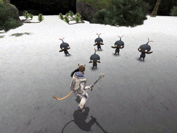
Although the game’s mechanics are largely unchanged, the designers have given belated thought to the beginners’ experience. The fearsome learning curve has been softened thanks to a tutorial, benevolent sprites to help newbies in distress and new trials to allow players to gain their first few levels quickly. No doubt spurred by customer retention metrics, the game’s designers have tried to create a more enjoyable newcomer experience.
Their attempts have failed.
Designers of MMOs (massively multiplayer online games) provide the game mechanics such as the architecture of the game world, the appearance and behaviour of enemies, and rules for movement and combat. But the primary architecture of an MMO is social. While game design provides the initial impetus to explore and level up, the thirst for experience points soon dries up without social context. FFXI’s original design acknowledges this, and encourages player collaboration by rewarding efficient party-based levelling. Thus a new player is quickly thrown into a social world, meeting other players with whom they can explore team-based missions and, finally, “endgame” content such as defeating Notorious Monsters. The fundamental premise of player versus AI foe continues all the way to the highest levels, but teamwork is essential at all times. Even the endgame reward system is socialised, as many boss battles only reward players with raw materials that must then be synthesised by another player. Value is created largely by users—all the game designers can do is trickle currency and items into the system and watch as they are bought, sold and reconfigured. The game outside of combat becomes largely an exercise of socioeconomics and commerce, with markets rife with inflation and deflation, supply and demand, and sharing of resources among clans and friends.
Although there is intrinsic reward in defeating a formidable opponent, social capital is the driving force in endgame play. Defeating Notorious Monsters grants players a title visible to all. Members of exclusive endgame linkshells, who hunt these monsters, wear their allegiance like a badge of honour. Even altruistic acts like raising fallen colleagues help to build reputation in the eyes of others.
In 2005, I was part of this world of interaction, rivalry and friendship. But almost all of my friends have now quit FFXI (endgame play tries your patience after a while), meaning this social incentive is missing from the game today. The shared exploration of the early days—such as being the first on our server to discover, and quixotically attack, Cerberus—has long gone.
FFXI is now a lonely experience for the new player. Experienced players hang around in ever-expanding high-level areas, where they can mingle with players of equal experience and trade endgame equipment. As a lowly level 14 character, these areas were off-limits. I was never once invited to join a levelling party and, since I kept my elite history concealed, established players assumed I had little of value to tell them. Instead of a social experience—a community bonding around the rules of the game—FFXI now feels joyless and isolated. For all their attempts to improve the newcomer’s experience of the game itself, the designers can do little to improve the social experience.
Virtual worlds in their dotage
Square Enix won’t want to lose the revenue from a relatively successful game, and have just appointed a new director to guide the game’s future development. But with a sequel just days away, new players are no longer the focus, minor gestures aside. Instead, the designers will continue to support the endgame activities of their existing, committed userbase. The time investment and social capital these players have built up will mean some keep their accounts, but many FFXI players will soon migrate to the sequel. I expect that FFXI will therefore implode in the foreseeable future. As resources are poured into the sequel, development of new content will cease, and eventually the maintenance costs will exceed revenue. Vana’diel will die, taking with it the memories and stories that took place within its territories.
(If a tree falls in an uninhabited digital forest, does it play a sound file?)
FFXI has had remarkable longevity, but the game is no longer fit for new players. In concentrating on endgame activity, the designers have (perhaps deliberately) caused the social architectures around low-level play to vanish. Where new players once experienced a rich world of social value, economics and interaction, they are now left with a mere game of player against environment.
Digital environments undergo an ageing process more aggressive than mere erosion. This ageing is not caused by the degradation of the environment, which stays as faithfully preserved as at its creation. Instead, the value of our digital worlds is eroded by relative decrepitude. Our games, our websites, our interfaces are soon rendered obsolete by more fully-realised alternatives. Final Fantasy XI loses to Final Fantasy XIV. MySpace loses to Facebook. The lure of the new feature set, the redesign, the higher polygon count is hard to resist. The death of our digital environments—websites, MMOs, operating systems—is inevitable. Entropy always wins.
Perhaps nostalgic sentimentality has no place in our futurist outlook, but in our eagerness to create the new we should consider the human experiences that lie within the walls of our antiquated structures. Designing to conserve experience, perhaps, is the digital industry’s sustainability challenge.
See also: James Bridle—The Value of Ruins at dConstruct 2010.
UX Brighton 2010 in review
UX Brighton was an enjoyable addition to the conference circuit, although there was much material that, however fascinating, I don’t view as user experience.
If further proof were needed about the strength of the UX industry, yesterday saw 270 attendees crammed into the Sallis Benney Theatre for a largely homegrown UX Brighton lineup.

Opener Eric Reiss channelled Lars von Trier with his own vow of design chastity. In doing so, he urged us to ground innovation in its true purpose of solving problems. Taking aim at some well-known UX targets, Eric bemoaned the fact that his Web Dogma is still as relevant in 2010 as ever.
Claire Rowland offered a fascinating managerial viewpoint on creativity (in spite of technical problems), dispelling myths and instead focusing on the roles of personality and intrinsic/extrinsic motivation in creative work.
Julian Hirst and Graham McAllister showed the application of UX and usability practice to the less publicised areas of B2B service design and games testing, with Graham’s galvanic skin response measurements forming an intriguing (if slightly impractical) measure of user enjoyment of a digital experience. Keeping the focus on research and testing, James Page and Sabrina Mach dismissed lab-based approaches as lacking context, instead pointing the way to remote ethnographic approaches that no doubt include their own.
The day’s theme of Designing for Behaviour paved the way for a strong marketing and advertising focus. Bunnyfoot’s John Dodd pulled the audience into David Ogilvy’s world of communication and research, ending on the ever-controversial eyetracking, while Johnny Holland chief kahuna Jeroen van Geel drew on the field of branding to demonstrate how products and services can become imbued with personality through tone of voice, microcopy and interaction design details. [See Does Technology Need Personality?]
In the light of such a focus on behaviour modification, Harry Brignull’s exposé on the seedy underbelly of Dark Patterns was a welcome adjunct. It was the ethical call to arms I’ve long espoused, and admirably demonstrated the shades of grey that lie between the poles of positive and negative influence. [See Harry’s slides.]
Headliner Rory Sutherland wrapped up eloquently, floating through obliquity, Austrian economics, the torture of weddings and framing in advertising. Putting one-dimensional metrics to the sword, Rory implored us to focus on the intangibles that abound in “cloud-like” human systems that resist numerical analysis. We must “cherish the small things” and focus on the details of experience and value. Rory’s dream of a Minister of Detail, with enormous power but no financial clout, goes sadly unrealised to date.
UX Brighton was an enjoyable addition to the conference circuit, although there was much material that, however fascinating, I don’t view as user experience. Personally I can live without the blunted popular science that abounds in the persuasion marketing field, and I’d be delighted to never again hear of Predictably Sticky Nudge Swans (or whatever it’s called). But this just reflects my personal framing of design, rather than any flaws with this entertaining and promising conference. Kudos to Danny and the team, and here’s to 2011.