Hunches about Material Design
A few reckons about Android L and Material Design spurred by yesterday’s Londroid event.
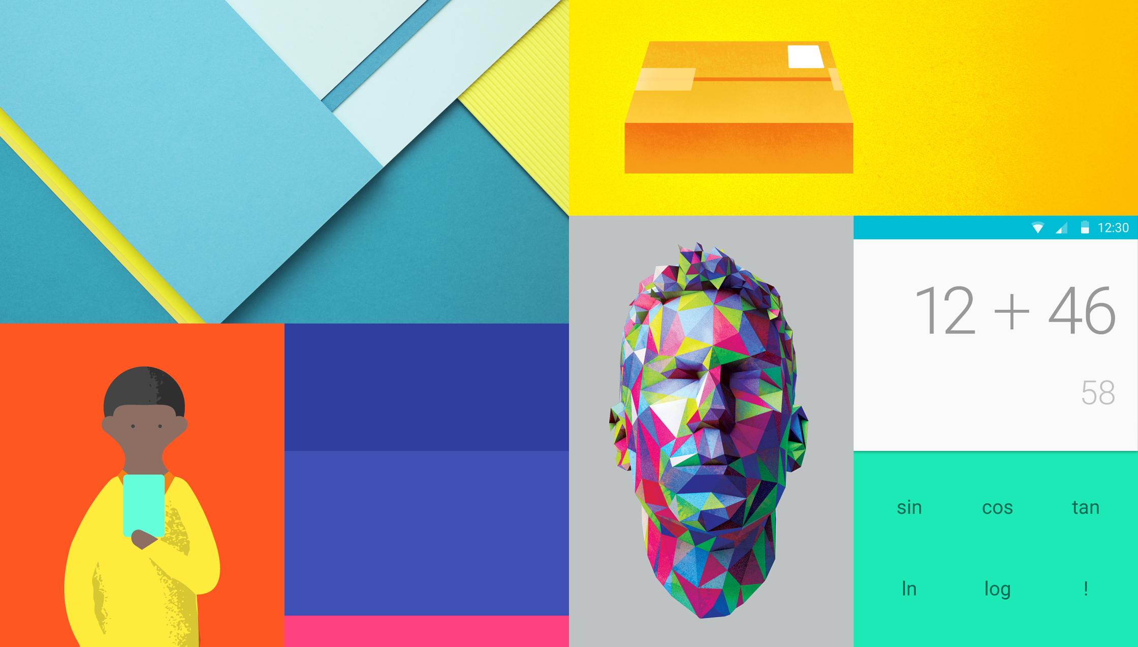
Motion
Motion is the heart of Material Design, right? The visual aspects are striking but pretty straightforward, easily gridded / copied / 87% alpha-d. But even professional designers struggle with motion skills and tooling at the moment, and I don’t think we’ll see widespread quality motion for a year or two.
Initially I suspect most people will ignore it or just chain together stock Google animations – touch ripple, card lift etc – with blunt and sluggish results. Some people will proudly learn every cranny of a prototyping tool but not back it up with animation theory, resulting in a neo-Kai’s Power Tools era of ostentatious overanimation.
However, a very small group of talented people will nail Material motion, and name their goddamn price.
Professionalisation continued
Holo was mostly nouns, and constraining ones at that: grids, patterns, components. Material Design adds verbs, and they’re divergent ones: respond, flow, express.
The resultant syntax is more complete but more esoteric – possibly more than non-designers are comfortable with. I suspect Android is slipping beyond the grasp of the bedroom coder. It happens with every platform, and I dare say Google are fine with that. Teams will need more specialisation to create the sophisticated, professional apps that will help Android compete on UX. You’ll need to be a better designer to do great Material Design, but the possibilities are more exciting.
And it’ll be these strong designers (and their engineering & product colleagues) who’ll forge the real future of Material Design. Don’t expect Google to provide the answers. They’ve served up examples and inspiration, but the canvas is now too broad (particularly on devices we don’t yet think of as Androidy) for one company to own UX innovation. There's scope for anyone to set a precedent that others rush to copy.
Floating action buttons

Since this is the visual element that best signifies Material Design (and, by extension, cutting-edgeness), I think we’ll see thousands of the suckers. Most will straddle unnecessary borders, and most will overprioritise a single task. The floating button suits a primary action that’s very primary. Designers will still want to use them when that’s not the case, so I suspect we’ll see extra buttons added as qualifiers.
“Add!”
“Okay, add what? Page, post, image, address, etc”
“Play!”
“Okay, play what? Song, album, artist, radio, etc”
Radial menus and all that: their time has theoretically been due for at least five years, so maybe this is it. Could work if done well, or it could be awful.
Google definitely Get It these days. Anyone who’s been watching their design output for a while now won’t be surprised. It’s clear their culture is changing, and their mobile consumer products have improved at a terrific rate. I think Material Design shows some of the best platform design thinking in mobile, and it’ll be fascinating to see how their competitors (not least Apple) respond.